CASE STUDY

02/04

OCEAN

BOTTLE

CASE STUDY

02/04

OCEAN BOTTLE

Client: Ocean Bottle 

Sector: Sustainable Consumer Goods

Ocean Bottle is a purpose-led company tackling the ocean plastic crisis through beautifully engineered, refillable bottles. Each bottle funds the collection of 11.4kg of ocean-bound plastic, the equivalent of 1000 plastic bottles, via a global network of plastic collectors. With a strong DTC presence, a growing B2B offering, and a fiercely engaged community, the brand had built real momentum. Their aesthetic leaned into activism and impact: bold, unapologetic, and unfiltered. The work here was about strengthening that momentum. I was brought in to evolve the visual language for scale, giving it the structure and creative discipline it needed to grow, without losing its soul.

Role: Creative Lead, Digital Design Language 

Scope: Visual ID Refinement & Systemisation 

The challenge was to bring greater coherence and hierarchy to a brand that had evolved quickly, without breaking what people already loved. Ocean Bottle needed a visual system that could balance its activist spirit with a more premium, lifestyle-led direction. The identity had to flex across a growing ecosystem: site, social, email, packaging and app, while staying true to the brand’s tone of voice and values. Colour needed to work harder across product-led palettes, and content needed a more consistent structure to support both storytelling and conversion. The aim wasn’t to simplify. It was to sharpen. To make the brand feel elevated and cohesive, without losing its purpose.

A challenge

What came before: The brand had purpose, a strong logo and product, plus an engaged community, but visually, things were starting to fray. The condensed protest-style typography no longer felt right for a more premium, lifestyle-led audience. Paired with the geometric sans serif of the logotype, it felt forced and unresolved. Colour was often used clumsily, and the lack of a clear system meant designers were improvising wildly. 

Client: Ocean Bottle 

Sector: Sustainable Consumer Goods
Role: Creative Lead, Digital Design Language 

Scope: Visual Id Refinement & Systemisation 

What came before: The brand had purpose, a strong logo and product, plus an engaged community, but visually, things were starting to fray. The condensed protest-style typography no longer felt right for a more premium, lifestyle-led audience. Paired with the geometric sans serif of the logotype, it felt forced and unresolved. Colour was often used clumsily, and the lack of a clear system meant designers were improvising wildly. 

  • Ocean Bottle is a purpose-led company tackling the ocean plastic crisis through beautifully engineered, refillable bottles. Each bottle funds the collection of 11.4kg of ocean-bound plastic, the equivalent of 1000 plastic bottles, via a global network of plastic collectors. With a strong DTC presence, a growing B2B offering, and a fiercely engaged community, the brand had built real momentum. Their aesthetic leaned into activism and impact: bold, unapologetic, and unfiltered. The work here was about strengthening that momentum. I was brought in to evolve the visual language for scale, giving it the structure and creative discipline it needed to grow, without losing its soul.

    The challenge was to bring greater coherence and hierarchy to a brand that had evolved quickly, without breaking what people already loved. Ocean Bottle needed a visual system that could balance its activist spirit with a more premium, lifestyle-led direction. The identity had to flex across a growing ecosystem: site, social, email, packaging and app, while staying true to the brand’s tone of voice and values. Colour needed to work harder across product-led palettes, and content needed a more consistent structure to support both storytelling and conversion. The aim wasn’t to simplify. It was to sharpen. To make the brand feel elevated, confident and cohesive, without losing its sense of optimism or purpose.

  • We started by identifying what needed to evolve, and what deserved to stay. The core brand idea of Small Bottle. Big Impact. was powerful, but the visual tools weren’t stretching far enough to elevate the brand’s credibility or support its momentum. I worked closely with the internal team to articulate a sharper definition of what Ocean Bottle stood for, and how it needed to show up. The strategy centred on the interplay of contrasting qualities: natural and manmade, human and mechanical, raw and refined. The challenge was to codify that blend in a way that felt premium without losing its purpose-led spirit. We needed a system that could flex across formats and functions, from social to packaging, lifestyle to policy, without fracturing. Colour, typography and art direction all had to serve the same purpose, to build coherence without dulling the energy. The new identity had to feel global and grown-up, while staying radically honest about the problem it exists to solve.

    The new system re-established clarity with a refined typographic approach. Condensed styles were replaced with LL Circular, a geometric sans serif that paired warmth with authority. Forward-leaning italics and lightweight caps brought pace, optimism and edge. Ocean-inspired graphics added contrast to balance the clinical structure. Photography focused on real people and real moments. Bold crops and natural texture gave the brand visual presence without slipping into cliché. Colour was central: neutrals built trust, while accents provided rhythm, emphasis and adaptability. The system also had to flex across an expanding product line, letting the palette shift without losing cohesion. At the centre sat the Ocean Bottle loop—a quiet icon with a lot to say. Across digital, packaging and brand playbooks, all elements come together through collage-style layouts, using type, imagery and shape to tell visual stories. The result is a confident, adaptable identity built to do good.


  • The refresh did more than elevate Ocean Bottle's look, it positioned the brand as a serious, design-first player with purpose at its core. Internally, the revised system brought the team structure and clarity, allowing consistent application across social, packaging, email, digital and retail touchpoints. The result is work that feels both calm and confident, with every visual decision reinforcing the brand’s mission. Within a year, Ocean Bottle had secured £7 million in new funding, signalling investor trust in the direction and credibility of the refreshed identity. Estimated annual revenue sits near £13 million, placing the brand firmly in the market at scale. This commercial traction aligns neatly with the improved market perception generated by a smarter visual presence. Their Instagram community grew by 40% in just fourmonths, driven by consistent posting and community management. Repeat purchase rates improved, and key partnerships — from Deloitte to Soho House — strengthened the brand’s commercial credibility. More than a million units sold have translated into around 11.4 kilograms of ocean-bound plastic removed per bottle, amounting to over 4.6 million kilograms of plastic cleared from waterways. This tangible impact has supported stronger partnerships and media coverage, elevating the brand’s profile beyond festivals and activism circles. Perhaps most importantly, the refreshed identity now works as hard as the product. It communicates certainty without arrogance, purpose without greenwashing, and gives the team the creative freedom to push forward with consistency and impact.

We started by identifying what needed to evolve, and what deserved to stay. The core brand idea of Small Bottle. Big Impact. was powerful, but the visual tools weren’t stretching far enough to elevate the brand’s credibility or support its momentum. I worked closely with the internal team to articulate a sharper definition of what Ocean Bottle stood for, and how it needed to show up. The strategy centred on the interplay of contrasting qualities: natural and manmade, human and mechanical, raw and refined. The challenge was to codify that blend in a way that felt premium without losing its purpose-led spirit. We needed a system that could flex across formats and functions, from social to packaging, lifestyle to policy, without fracturing. Colour, typography and art direction all had to serve the same purpose — to build coherence without dulling the energy. The new identity had to feel global and grown-up, while staying radically honest about the problem it exists to solve.

The new system re-established clarity with a refined typographic approach. Condensed styles were replaced with LL Circular, a geometric sans serif that paired warmth with authority. Forward-leaning italics and lightweight caps brought pace, optimism and edge. Ocean-inspired graphics added contrast to balance the clinical structure. Photography focused on real people and real moments. Bold crops and natural texture gave the brand visual presence without slipping into cliché. Colour was central: neutrals built trust, while accents provided rhythm, emphasis and adaptability. The system also had to flex across an expanding product line, letting the palette shift without losing cohesion. At the centre sat the Ocean Bottle loop—a quiet icon with a lot to say. Across digital, packaging and brand playbooks, all elements come together through collage-style layouts, using type, imagery and shape to tell visual stories. The result is a confident, adaptable identity built to do good.

The solution

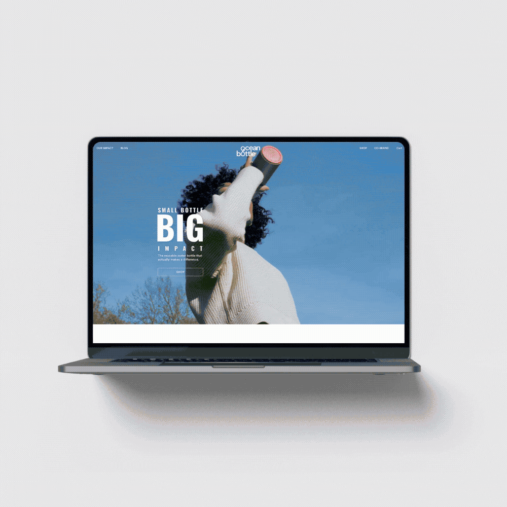
Working closely with a UX Designer, product pages were restructured to improve clarity, hierarchy and conversion. A flexible colour system supported both light and dark modes, while highlighting the full product range with consistency and warmth. Each visual choice helped connect the practical with the purposeful, keeping the experience premium, clear and easy to navigate.

The new site brought clarity and structure to Ocean Bottle’s expanding product line, while elevating the lifestyle feel of the brand. A refined typographic system, bold photographic art direction, and cohesive colour use helped balance purpose with polish, building a premium user experience without losing the energy of the original identity. From product pages to social proof, every element was designed to support both storytelling and conversion.

To support long-term consistency, I created a comprehensive brand playbook. Designed for the in-house team, it codified the system and helped steer day-to-day execution without dampening creativity.

Social was a key space to build community and energy around the brand. It offered more creative elasticity than other channels, a place to flex the identity, dial up emotion, and layer storytelling through type, colour and imagery. The grid system balanced cohesion with character, giving the brand room to speak with confidence, humour and heart.

The result

The refresh did more than elevate Ocean Bottle's look—it positioned the brand as a serious, design-first player with purpose at its core. Internally, the revised system brought the team structure and clarity, allowing consistent application across social, packaging, email, digital and retail touchpoints. The result is work that feels both calm and confident, with every visual decision reinforcing the brand’s mission. Within a year, Ocean Bottle had secured £7 million in new funding, signalling investor trust in the direction and credibility of the refreshed identity. Estimated annual revenue sits near £13 million, placing the brand firmly in the market at scale. This commercial traction aligns neatly with the improved market perception generated by a smarter visual presence. Their Instagram community grew by

40% in just four months, driven by consistent posting and community management. Repeat purchase rates improved, and key partnerships — from Deloitte to Soho House — strengthened the brand’s commercial credibility. More than a million units sold have translated into around 11.4 kilograms of ocean-bound plastic removed per bottle, amounting to over 4.6 million kilograms of plastic cleared from waterways. This tangible impact has supported stronger partnerships and media coverage, elevating the brand’s profile beyond festivals and activism circles. Perhaps most importantly, the refreshed identity now works as hard as the product. It communicates certainty without arrogance, purpose without greenwashing, and gives the team the creative freedom to push forward with consistency.

  • Google logo in black and white.
  • FARFETCH logo in black on a white background
  • The image shows the words "ocean bottle" with an ocean wave illustration integrated into the design.
  • Text reading 'N*TION ON THE HIGH ST.' in black on a white background.
  • Lenovo logo in black on a white background
  • TotallyMoney logo on a black background
  • Facebook logo in black
  • Callaly logo in black text on a white background
  • Google logo in black on a white background
  • FARFETCH logo text on a black background
  • Close-up of a black ocean bottle with the text 'ocean bottle' printed on it.
  • Text reading 'N*TON ON THE HIGH ST.'
  • Lenovo logo in black on a white background.
  • TotallyMoney logo on a dark background
  • Facebook logo in black and white
  • Callaly logo in black text on a white background

VIEW NEXT PROJECT /

CALLALY

Launched a new category in period care with clarity and impact. Created an expressive identity and guided design across channels.