CASE STUDY
CALLALY
CASE STUDY
CALLALY
Callaly is a UK-based femcare startup reinventing period care through the Tampliner, a patented tampon and liner in one. Backed by medical expertise and certified B Corp values, the brand was preparing for scale. I was brought in to translate a new identity into a coherent, engaging digital presence across site, content, and campaigns.
-
This hybrid role spanned creative direction, brand guardianship and hands-on design. The identity was strong but the system needed tightening and clearer leadership. I elevated layouts, photography, iconography and storytelling across web and campaigns, making confident calls on tone. Alongside directing shoots and freelancers, I translated values into scalable standards.
-
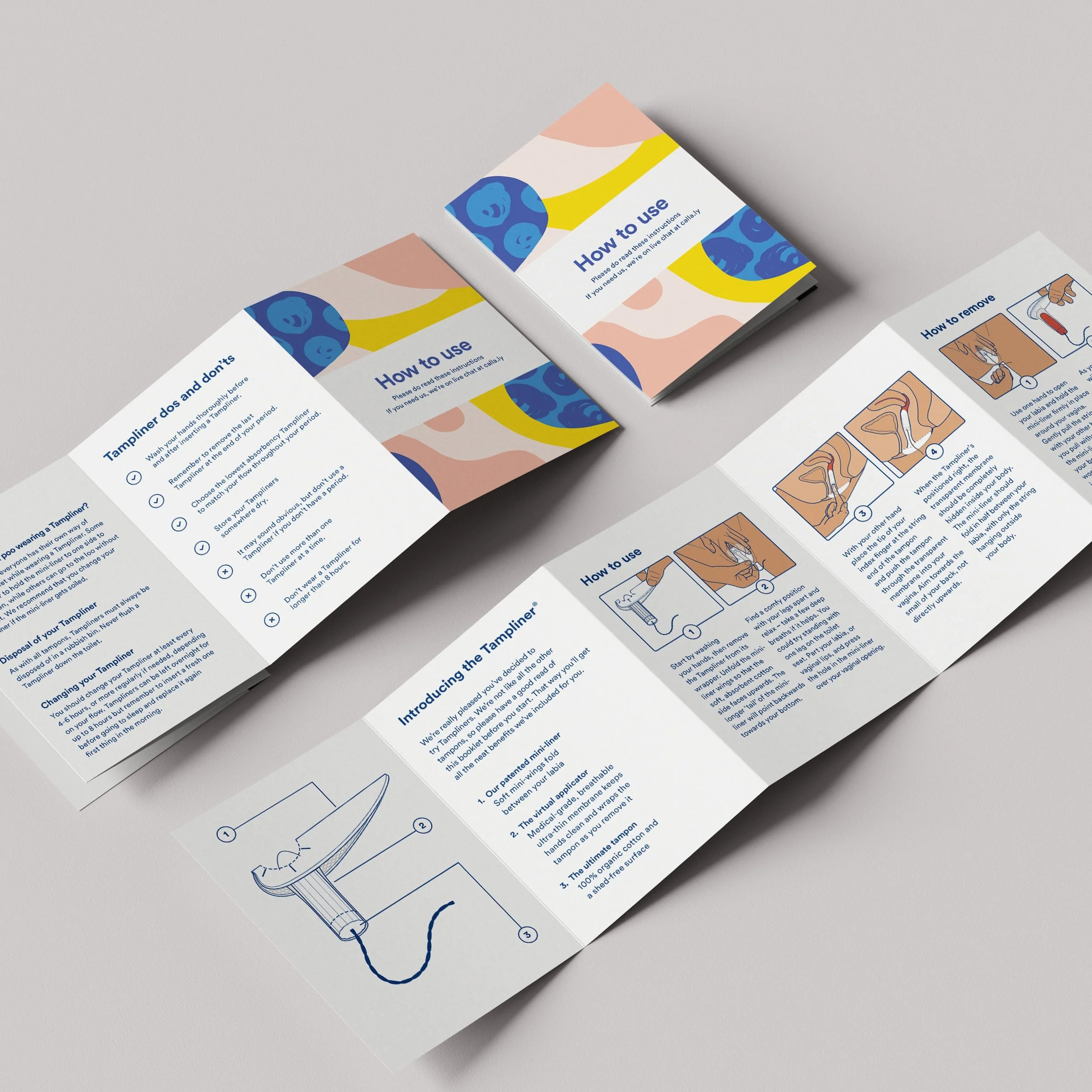
I was brought in to close the gap between strategy and execution. Callaly had invested in UX and identity but lacked a cohesive system. I led art direction for a new product and stop motion shoot, assembling an all female team and aligning vision through detailed briefs and shoot plans.
I redesigned the website with their developer, refining layout, typography and interaction, and updated guidelines, stationery and packaging with clearer rules around colour and photography.
The resulting system prioritised flexibility, clarity and emotion, using product-led imagery and animation to express warmth and difference while creating a structured toolkit the team could confidently scale. Every decision made the brand feel considered and ready for growth. -
The visual evolution was strategic, not cosmetic. By strengthening the foundations and creating clearer, more consistent assets, Callaly relaunched the Tampliner with a cohesive website, elevated photography and a flexible system across digital, print and motion. Confidence followed.
The brand closed a €1.9 million Crowdcube round and later secured £13.2 million in funding, including Innovate UK support. Orders surged, the initial launch sold out, and expansion into European markets accelerated.
Industry recognition grew in parallel, including TIME’s 100 Best Inventions and Red Dot Best of the Best. This was not reinvention, but reinforcement, giving the brand the clarity and creative structure to scale with credibility.
The before
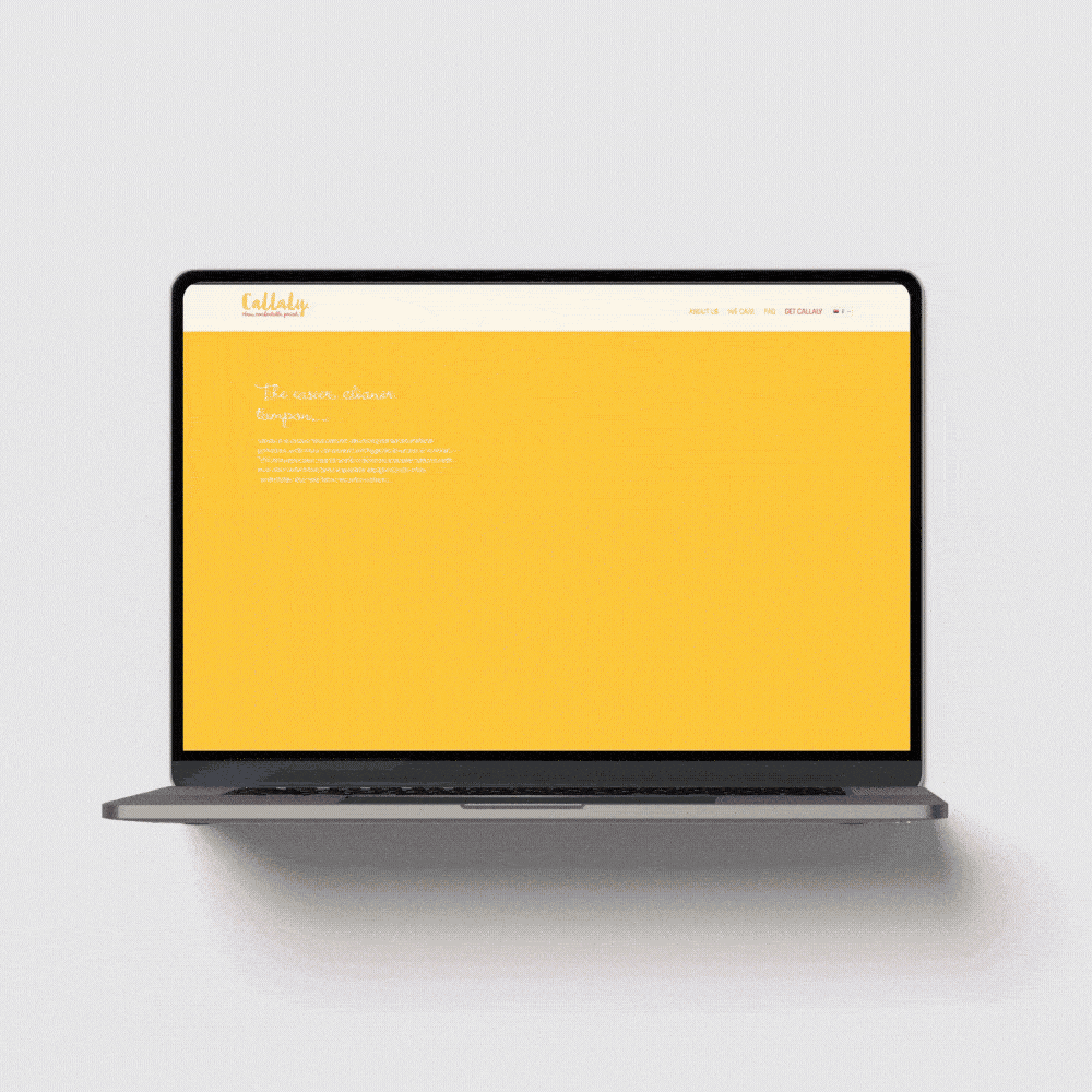
What came before: The website needed rebuilding from scratch. A UX audit had been completed, but the site wasn’t keeping pace with the brand’s ambition. While the new identity was bold, especially the graphic patterns and colour palette, it hadn’t yet been applied consistently. With only early packaging and one small shoot in place, the brand felt visually underpowered. The team struggled to use the colour system confidently, and the existing photography lacked lifestyle context and the human warmth needed to drive engagement.
The after


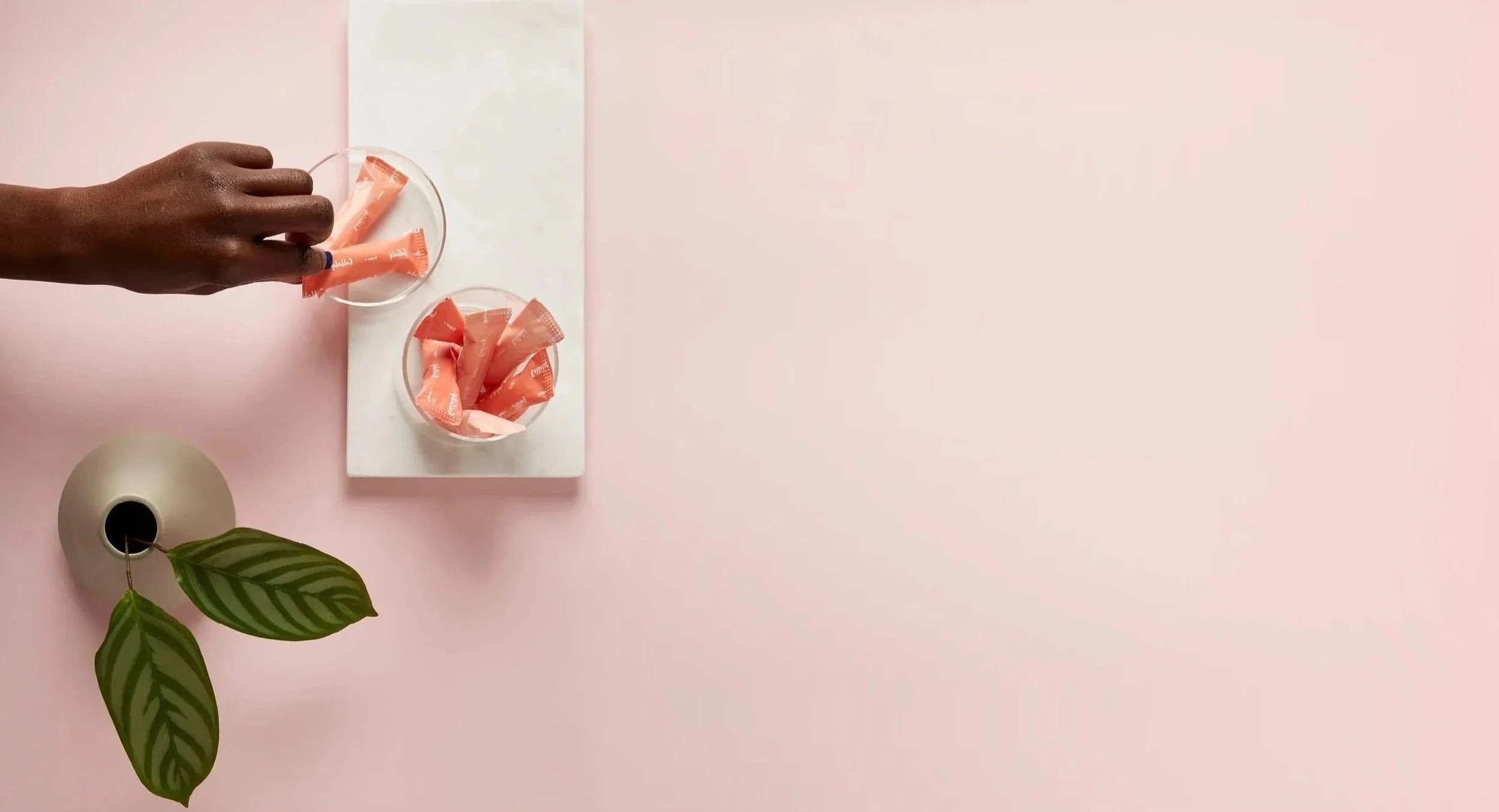
Every visual decision stemmed from Callaly’s brand character - smart, caring, approachable. Using real hands (rather than faces) gave us warmth and relatability without locking the brand into specific identities. Stop motion sequences added charm and function, helping customers understand the product in a way that felt informal, clear and on-brand. It was a flexible, human-centred solution, rooted in strategy, not just style.


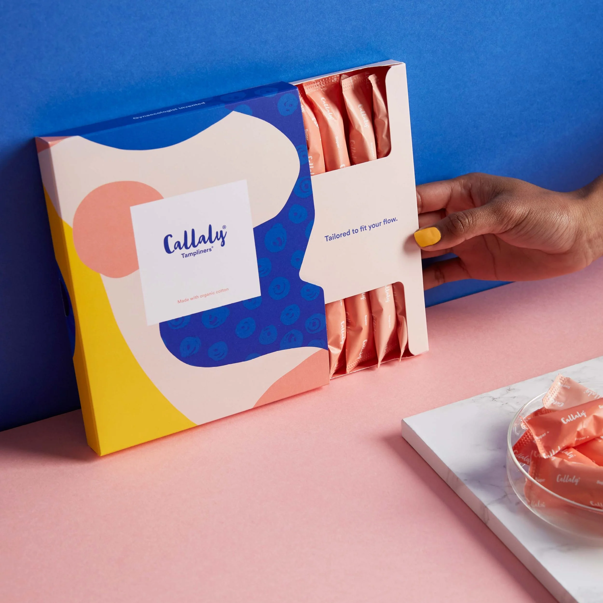
Packaging had already set a bold visual tone, but translating that tone across content and channels required strategy, not guesswork. I developed clear creative direction ahead of the shoot, aligning mood, palette and styling to reinforce the brand’s warmth without tipping into cliché. Every detail was considered, from lighting and props to messaging and materials, creating visual coherence with real emotional intelligence. With skamps, shot lists and shared intent in place, the team could relax and deliver their best work.


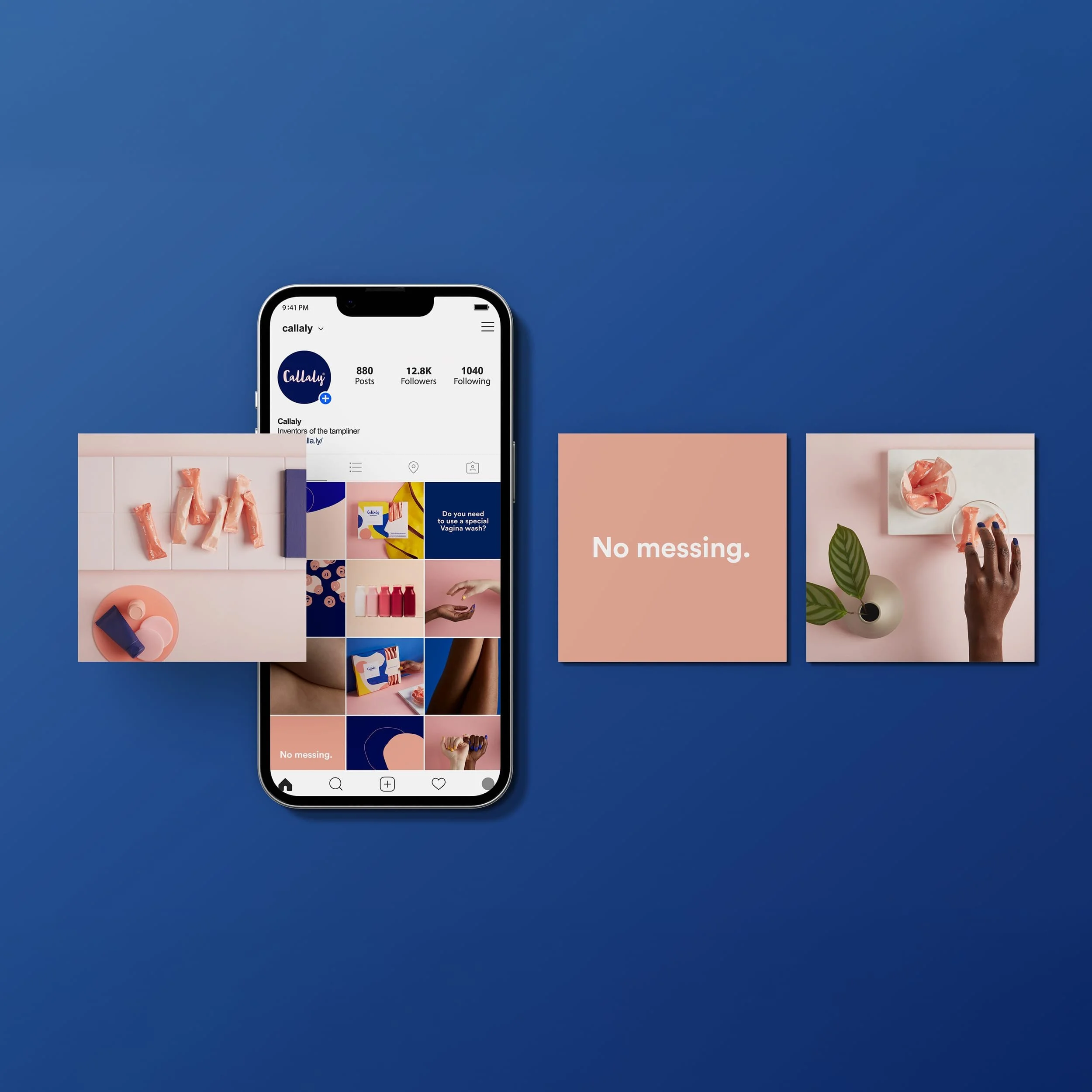
A stronger identity laid the foundation for a sharper content strategy. With clear visual rules in place, we could lean into Callaly’s bold tone of voice and build a social presence that was confident, consistent and true to character, part activist, part agony aunt. The result? A feed that informed, engaged and didn’t flinch. Just like the product.

The website was the culmination of the brand rollout, where strategy, design and UX came together to serve the product and the people it was made for. Built in close collaboration with the lead developer, every page was designed to feel warm, trustworthy and clear without tipping into clinical or cliché. Visual storytelling helped customers understand the product. The tone of voice built credibility without losing charm. From layout to language, every detail reinforced the brand’s values: care, confidence and quiet disruption.

The updated guidelines grounded the team in clear direction around colour, photography and layout, a practical, flexible system that honoured the original identity while unlocking more creative freedom across channels.


Every visual detail was rooted in intention. Props, tone, and composition were designed to reflect Callaly’s character, warm, smart and principled. Nothing off-the-shelf. Everything on-brand


Developed a modern identity and digital system for a cross-border payments start-up
See next

Redefined brand clarity and authority for a global security company. Delivered strategic frameworks and a bold, systems-first identity.