
CASE
STUDY
TRISHA
HEWITT
COMMS
CASE STUDY
TRISHA HEWITT
COMMS
Trisha Hewitt Communications is a solo practice built on decades of experience across journalism and local government, specialising in high-stakes, people-first communications. While Trisha’s reputation was well established, the brand needed to reflect her depth, credibility, and calm authority, while remaining simple enough to operate day to day and flexible enough to support future growth beyond the public sector.
-
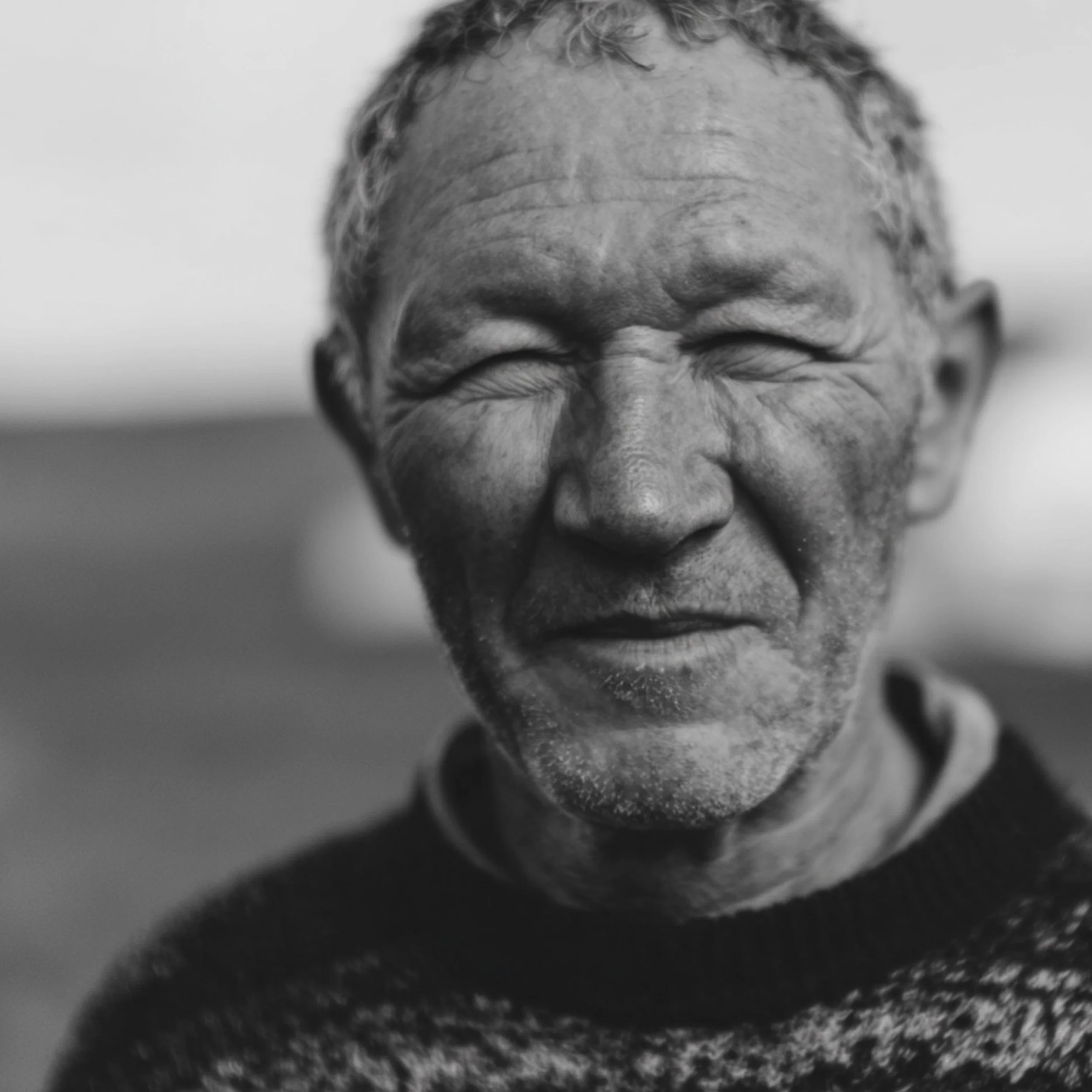
The challenge was translating a deeply human, trust-led practice into a credible system without falling into consultancy tropes or personal branding clichés. The identity needed to feel grounded and quietly confident, avoiding corporate polish or regional sentimentality. Without a photoshoot budget, human imagery still had to convey empathy, warmth, and care across all touchpoints.
-
The strategy positioned Trisha as a calm, trusted advocate: someone who listens first, translates complexity, and brings clarity without performance or ego. The work defined a people-first communications practice rooted in empathy, trust, and professionalism, emphasising experienced, plainspoken support rather than agency-style positioning. Most valuable when pressure is high, the role is to steady, not amplify. The visual language expresses advocacy through clarity rather than volume. Editorial structure, disciplined typography, and generous spacing establish calm and credibility, while tactile details and carefully chosen human imagery introduce warmth without sentimentality. A looping signature mark acts as a gesture of encouragement and continuity, reinforcing trust under pressure while remaining grounded, composed, and quietly confident across all applications.
-
The identity has received strong positive feedback, particularly for the website, which is often noted for its clarity, tone, and calm authority. Clients and peers have responded to the human quality of the work, recognising how naturally the visual language supports Trisha’s way of communicating. The system articulates the depth of her experience without overstatement, reinforcing trust and credibility from first touch. Rather than drawing attention to itself, the identity creates space for conversations to unfold with confidence. It provides a coherent, flexible framework for workshops, advisory materials, and client communications, supporting complexity while remaining accessible and grounded. Crucially, it positions the practice for future growth beyond the public sector, while preserving the voice, values, and steadiness existing clients recognise.
The before
What came before: A single pixelated logotype with no underlying strategy or visual system. This was a foundational project, requiring a full visual identity system to be developed from scratch.
The after
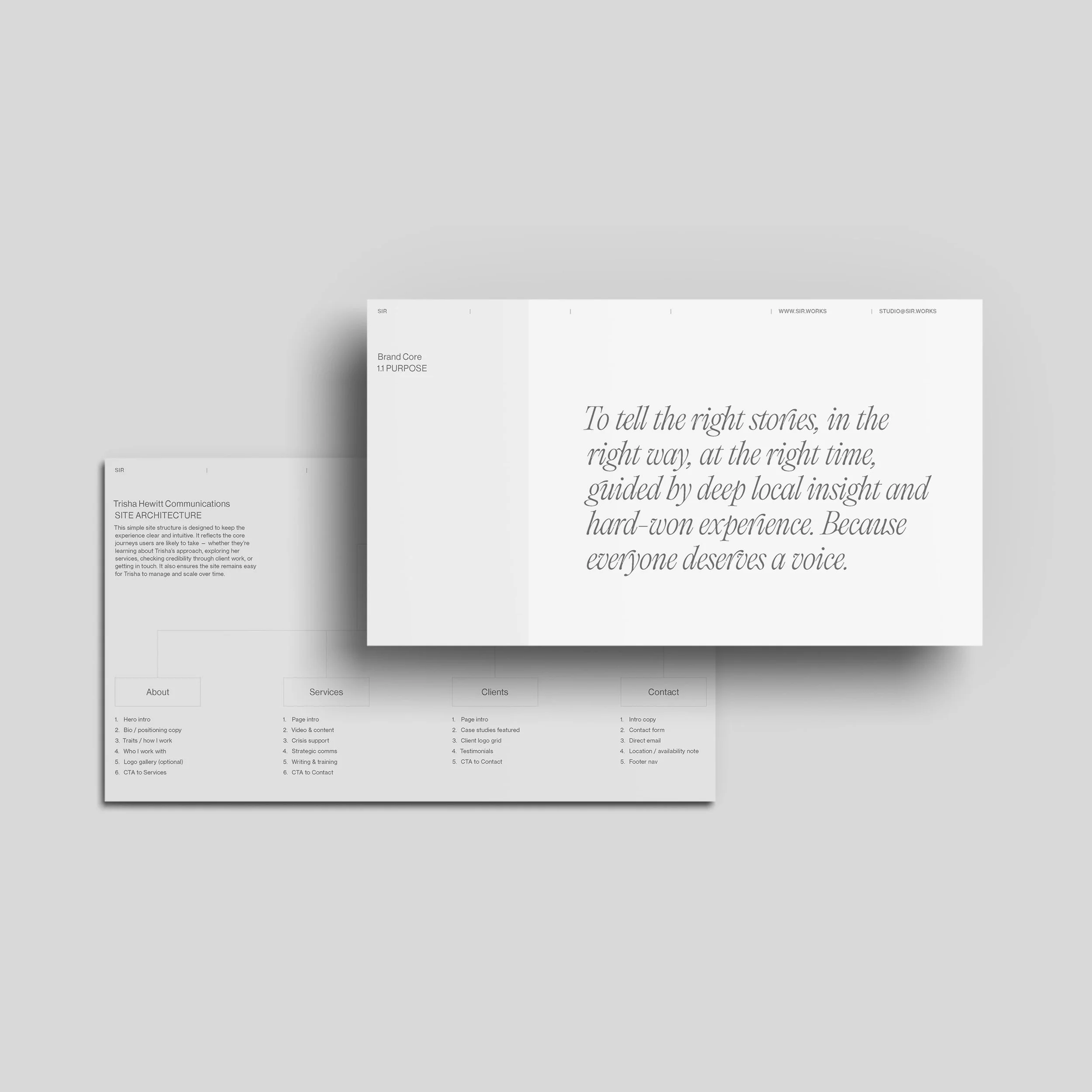
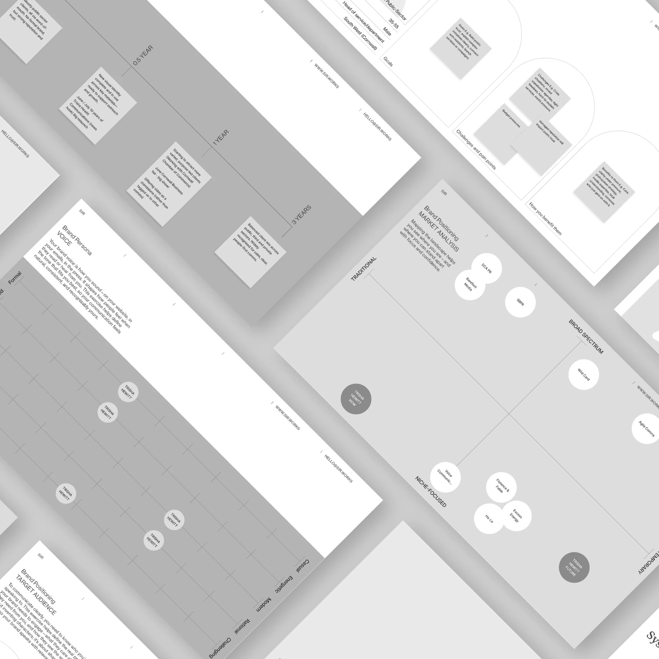
Early workshops clarified purpose, audience, and positioning, shaping brand foundations and early wireframes. Brand DNA informed hierarchy and content flow, ensuring navigation and messaging reflected how Trisha actually works in practice.
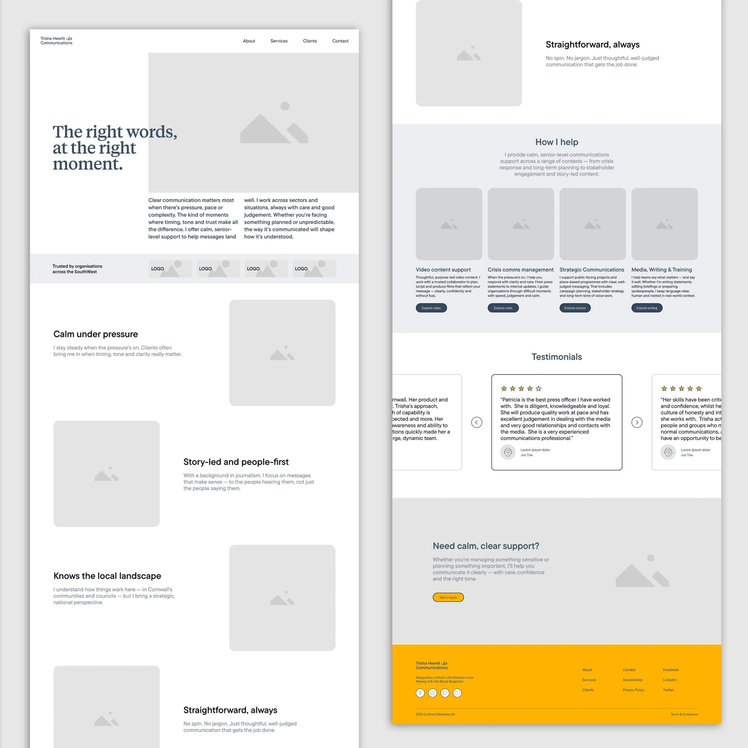


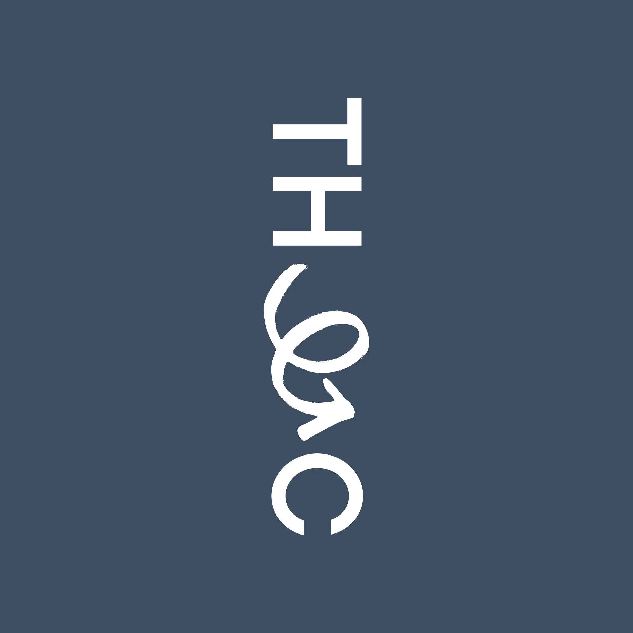
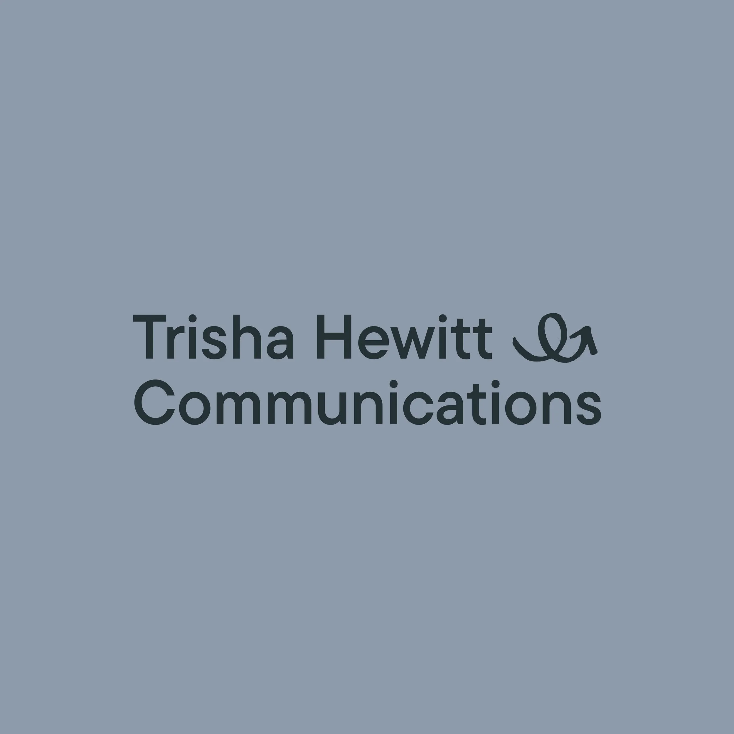
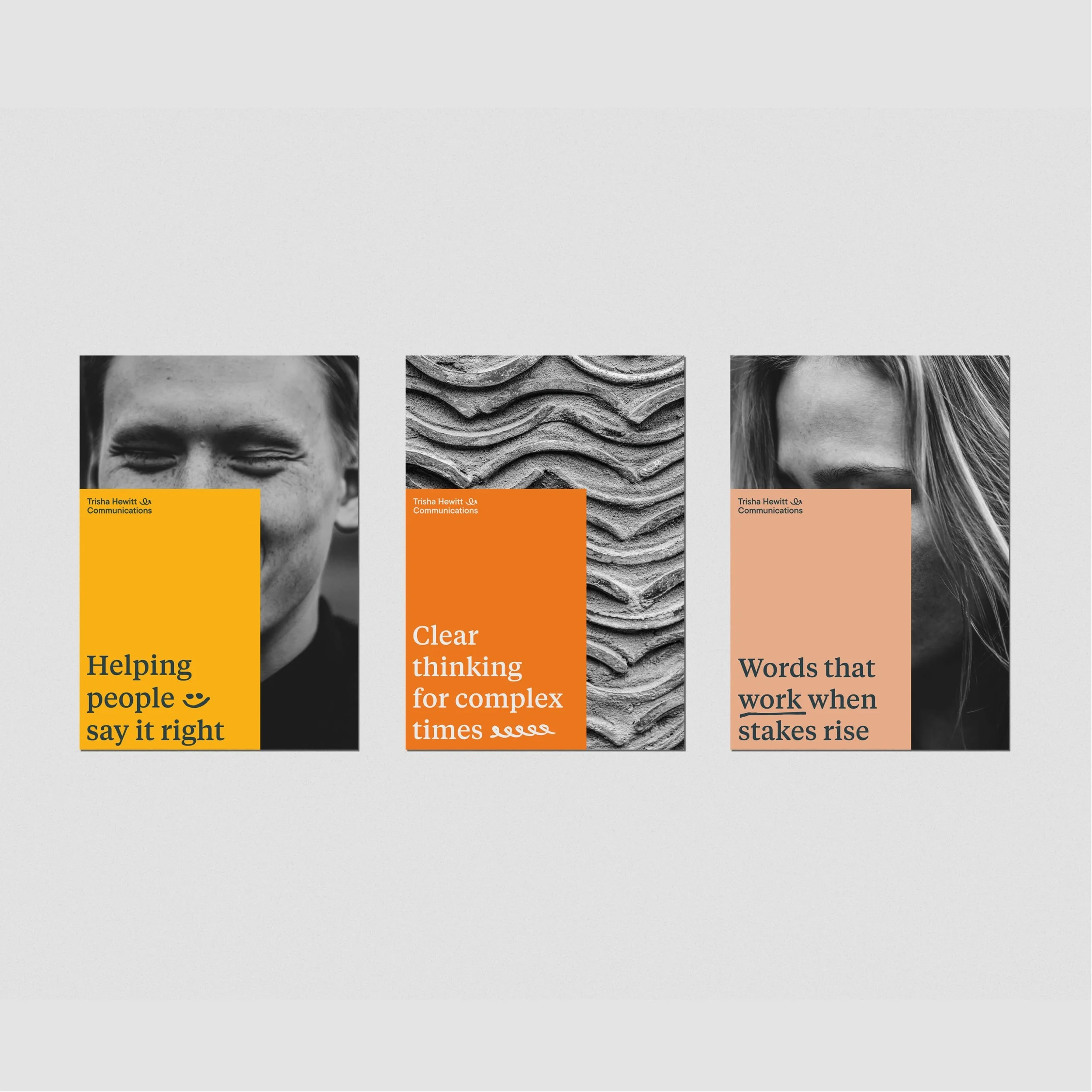
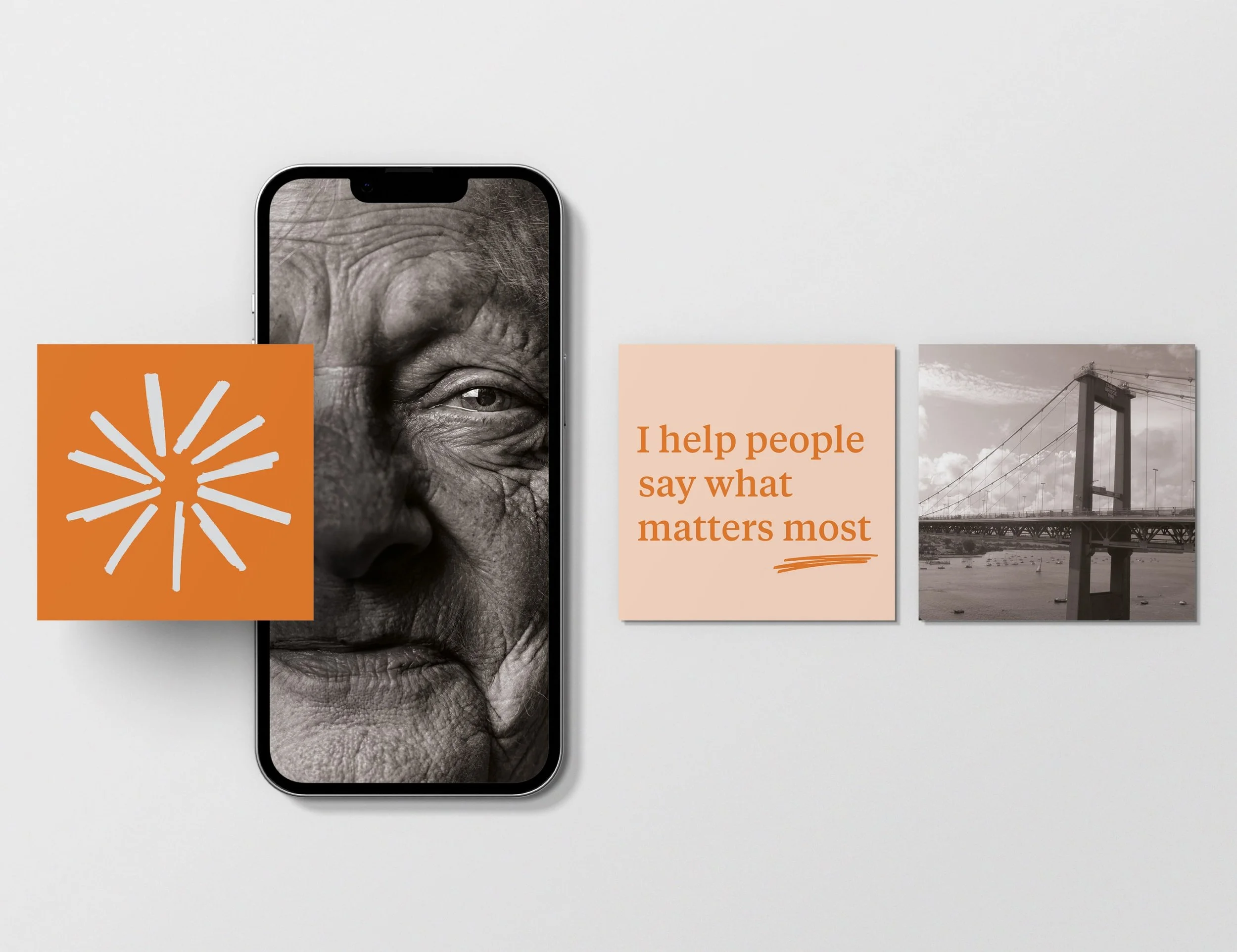
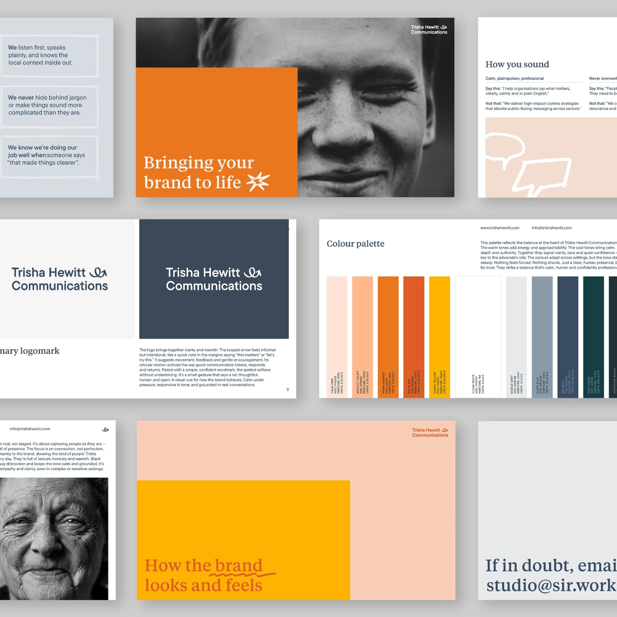
The identity brings clarity and warmth together through a simple but expressive system. A looped, hand-drawn arrow introduces movement, feedback, and gentle encouragement, echoing how good communication listens, responds, and returns. Paired with a confident wordmark, it softens without undermining authority. Built to flex across formats, the mark adapts from formal reports to quick digital moments while remaining recognisable. A balanced palette combines warm, approachable tones with cooler shades that bring calm and depth, signalling care and quiet confidence. Typography reinforces this balance: a thoughtful serif for headlines and a steady sans serif for body copy, creating a clear, human structure that lets the message lead.
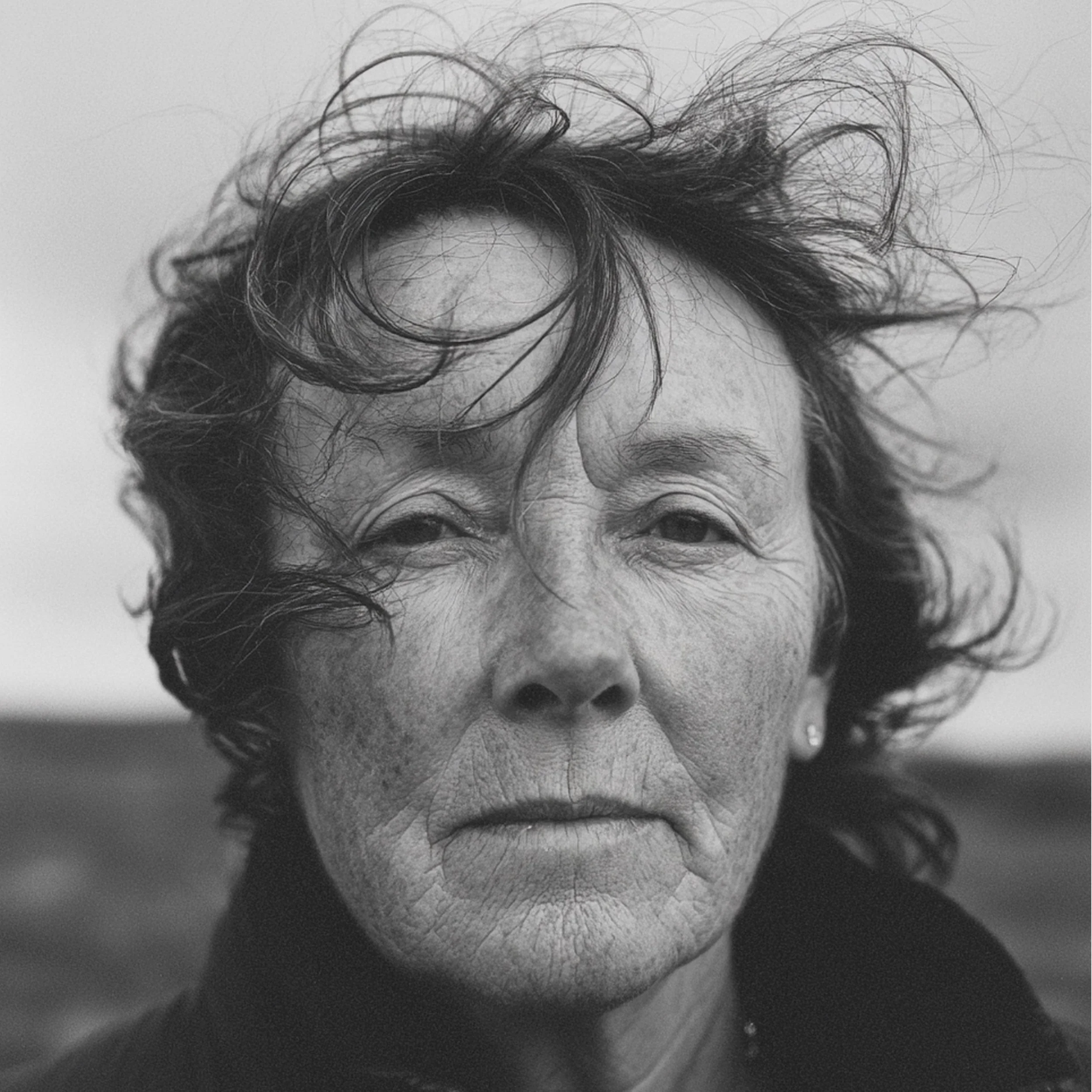

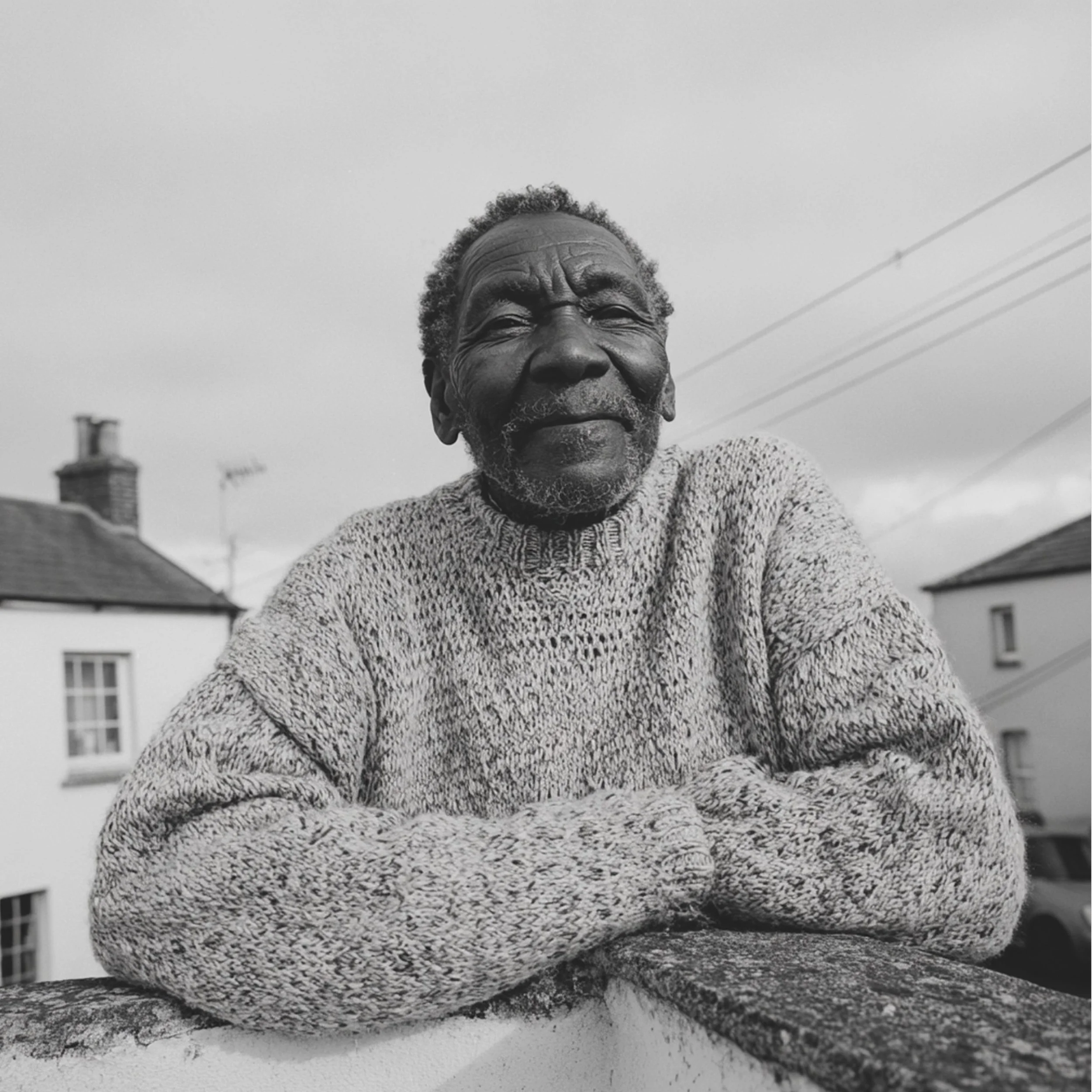
Photography is natural and unstaged, focused on connection rather than perfection. It captures people as they are: expressive, open, and present. Texture, honesty, and warmth bring humanity to the brand. Black and white strips away distraction, keeping the tone calm and grounded, showing empathy and clarity in sensitive settings.
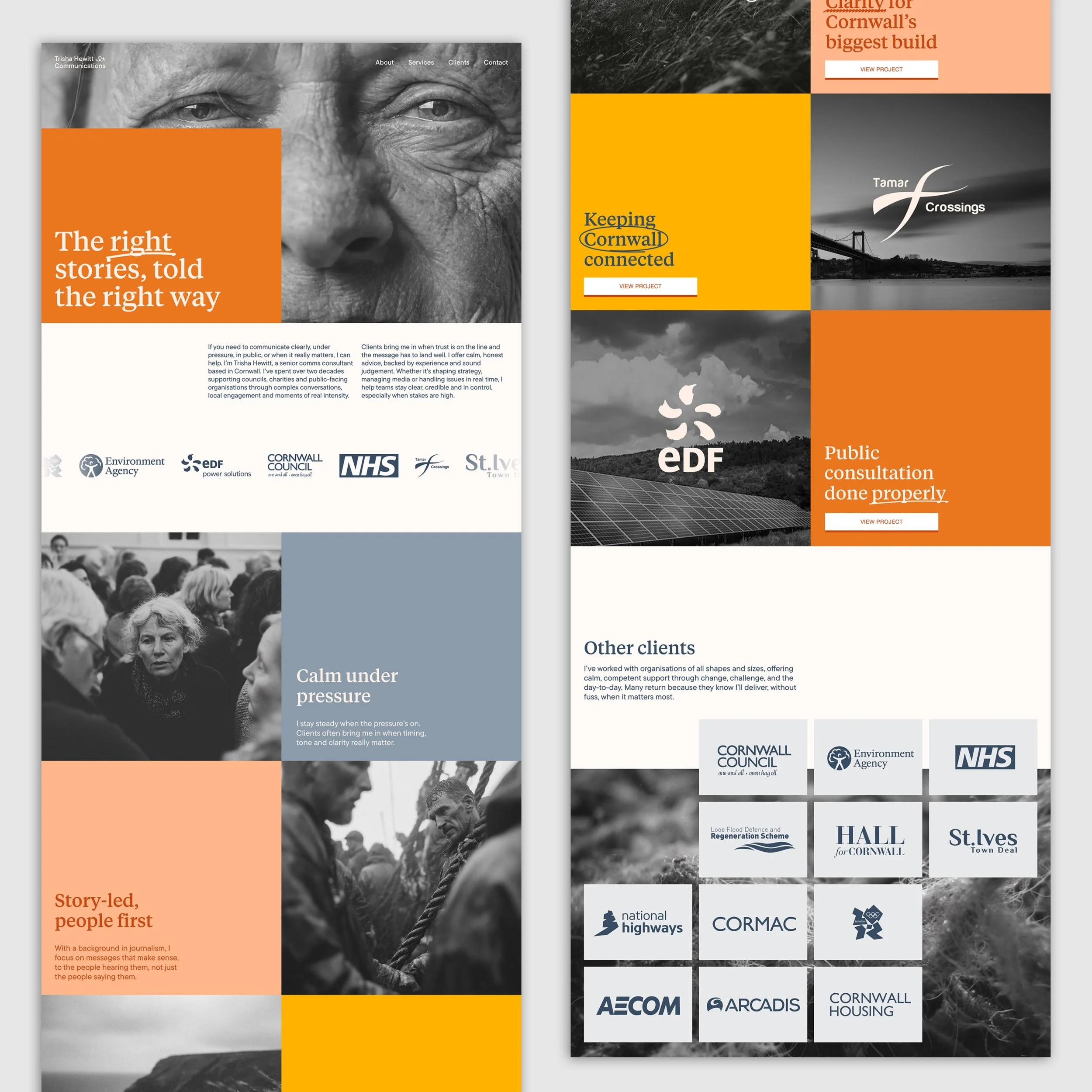
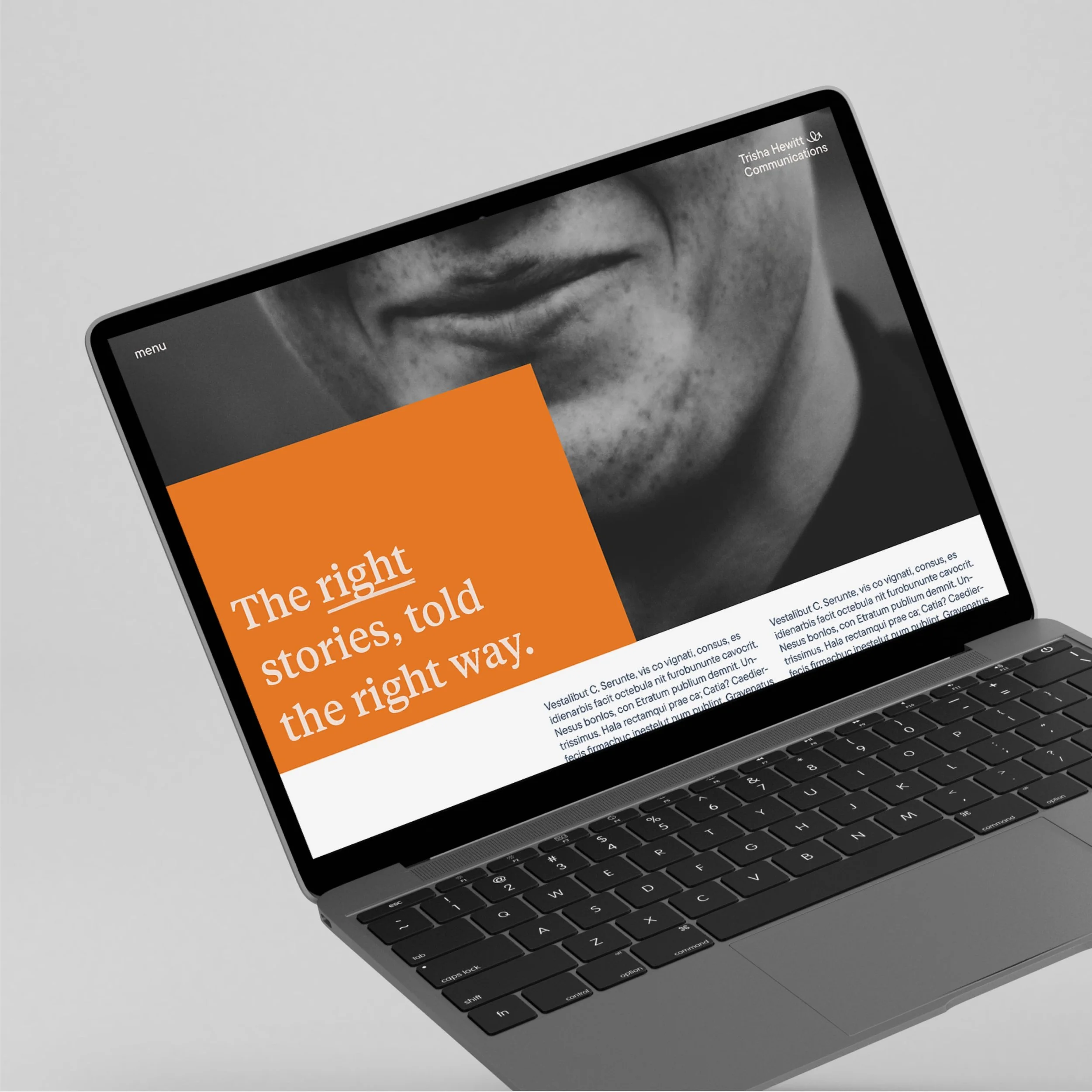
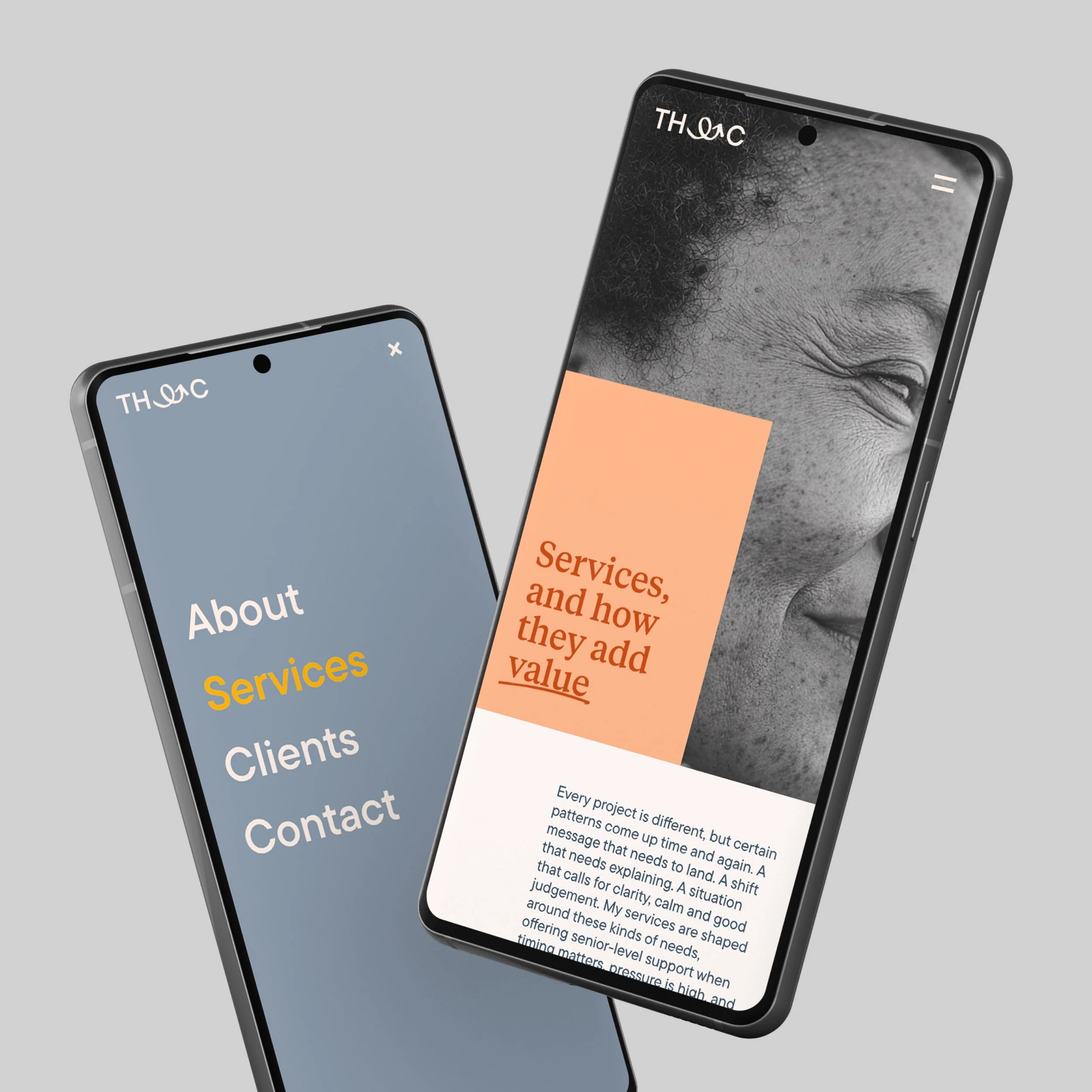
The website focuses on clear communication, trust, and helping the right people understand how Trisha works. Information architecture and UX decisions prioritise clarity and confidence, reducing cognitive load in high-stakes contexts through considered hierarchy, navigation, and content flow.
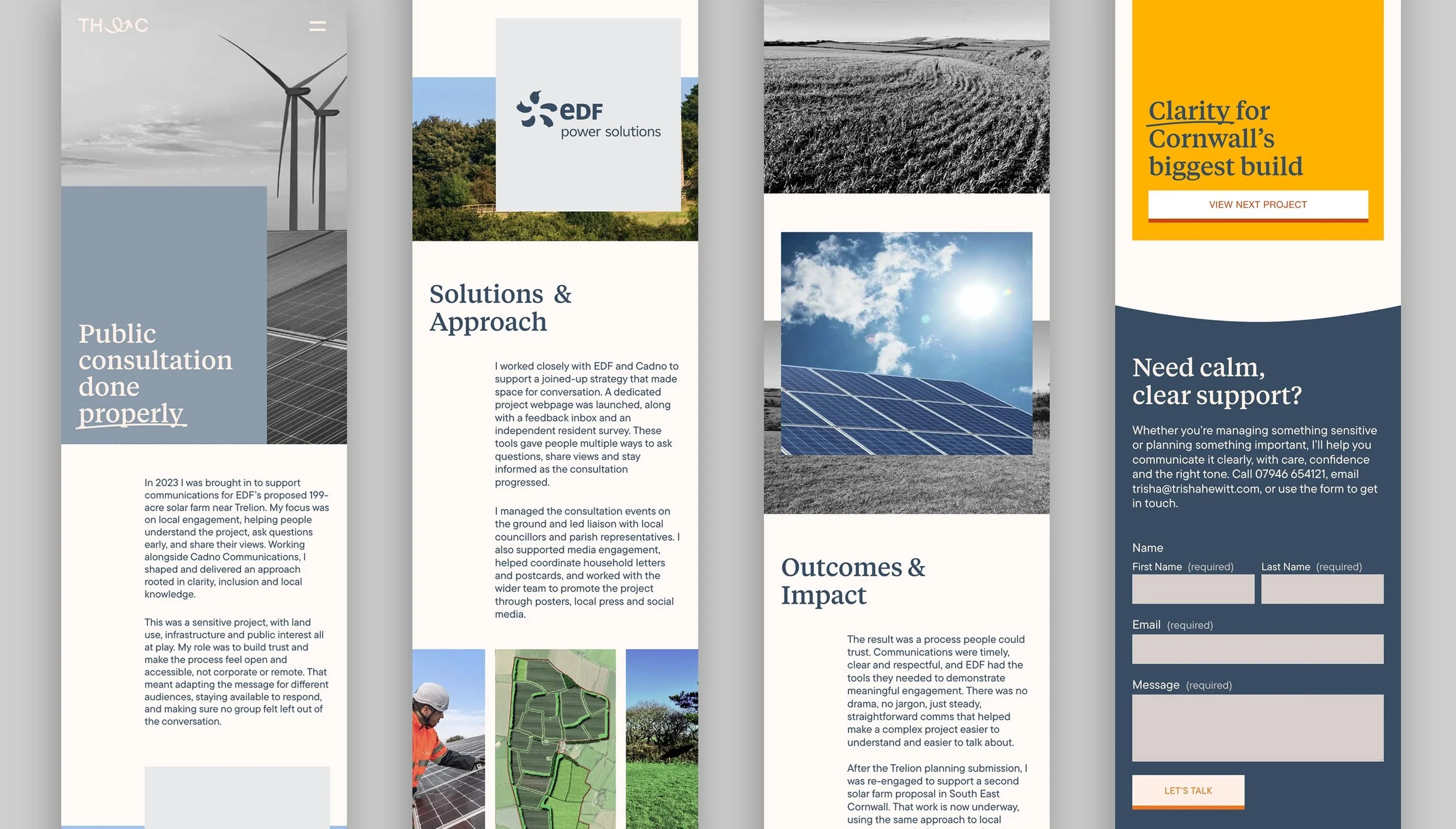
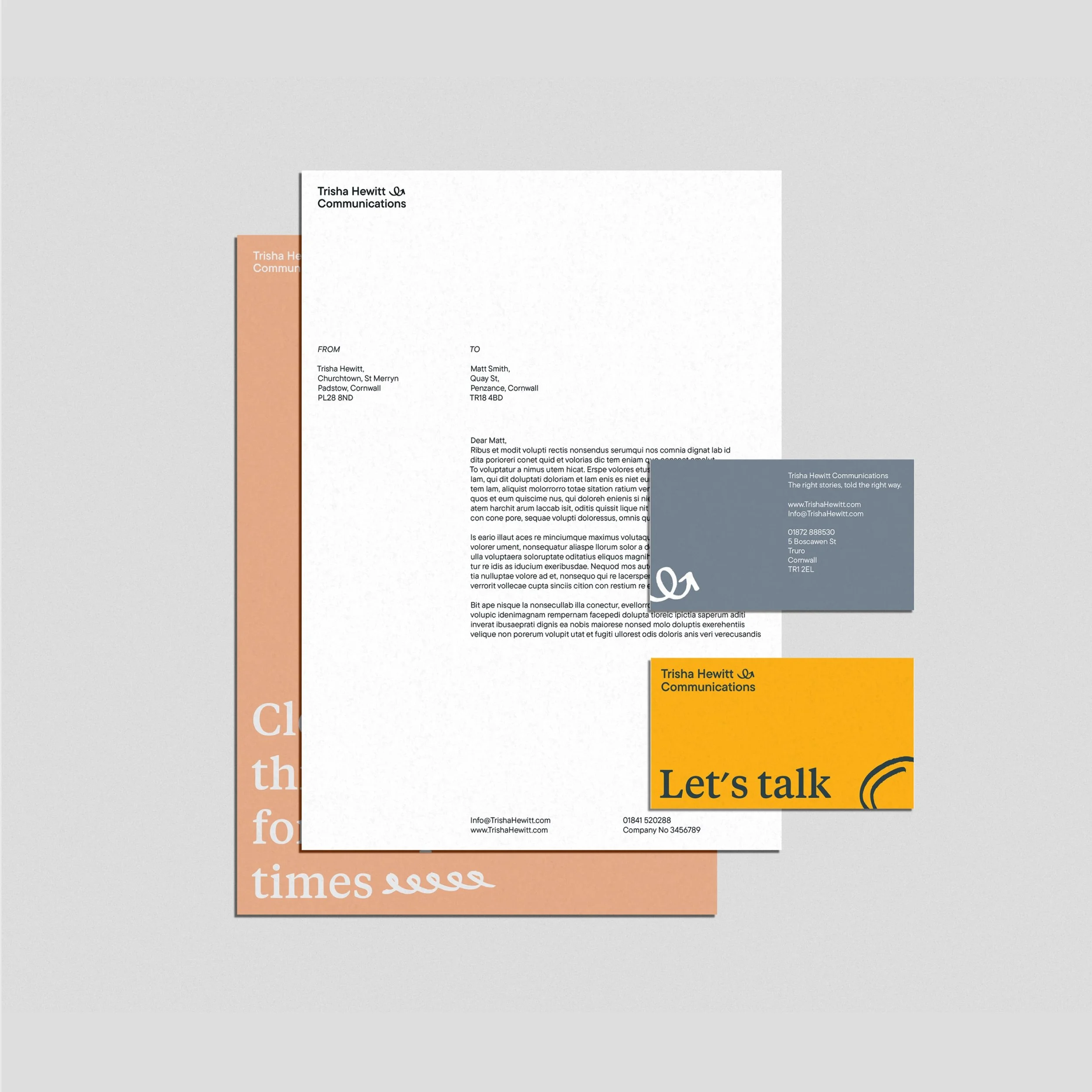
The identity was designed to scale across everyday communications and be easy for a non-designer to use. Brand principles and visual rules are codified into a flexible toolkit, supporting consistent decisions while maintaining clarity, warmth, and credibility. Together, the system supports clear, human communication under pressure and reflects how Trisha works in practice: calm, grounded, and people-first


Developed a modern identity and digital system for a cross-border payments start-up