
CASE
STUDY
DAISYLINK
CASE STUDY
DAISYLINK
DaisyLink is a next-generation payments platform bridging fiat and crypto rails through stablecoin settlement. Pre-launch and operating in high-scrutiny markets, the business needed a brand that could signal trust, technical credibility, and forward momentum before the product existed, while supporting investor confidence and future regulatory legitimacy.
-
Entering a volatile fintech landscape where visual language is polarised between conservative finance and speculative crypto, credibility was fragile and scrutiny high. The project followed exploratory work by another designer, centred on an illustrative logo direction misaligned with DaisyLink’s technical depth and audience. The work restarted from first principles to establish a clearer, more defensible strategic and visual foundation for scale and long-term trust.
-
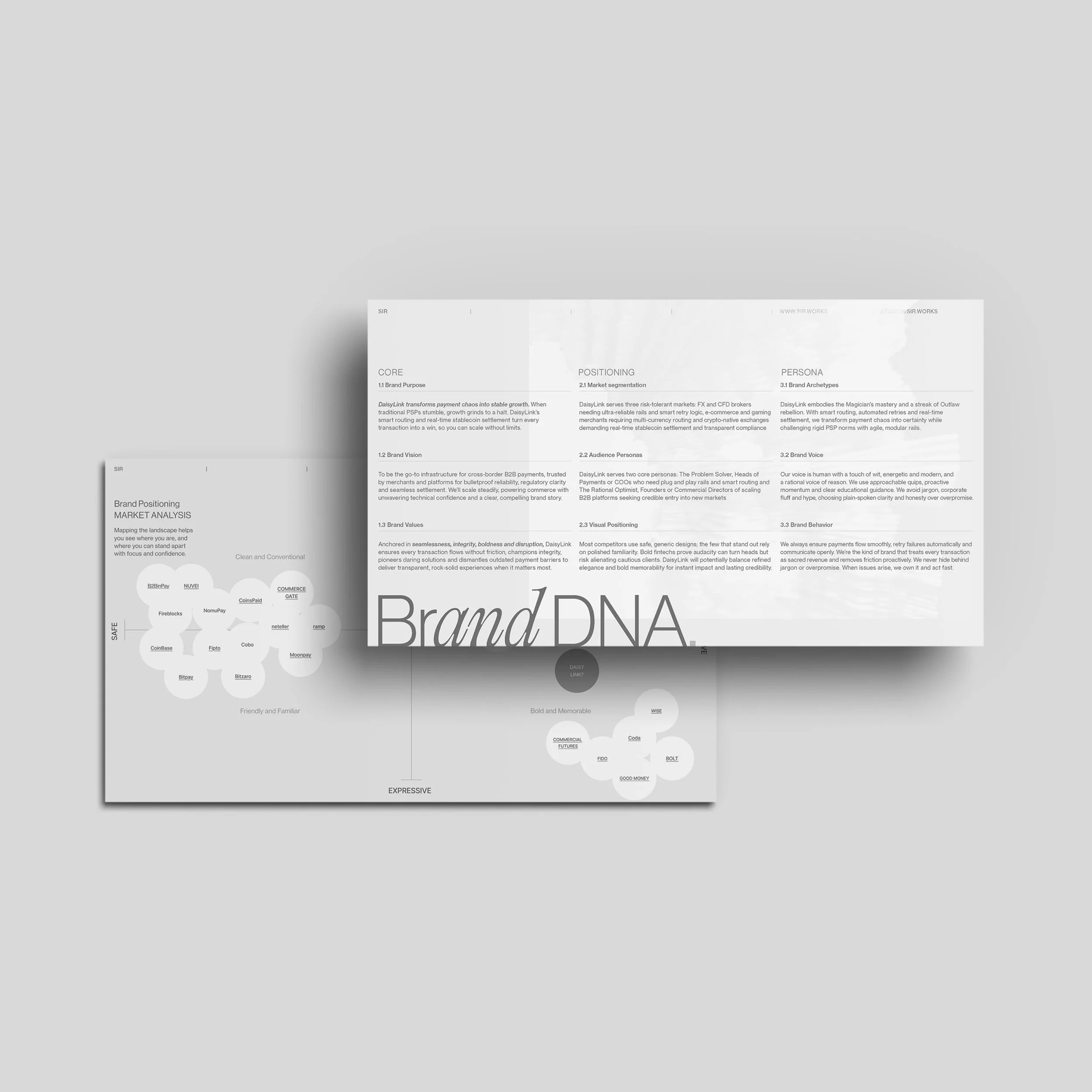
Underpinned by a systems-first mindset, the solution framed DaisyLink as enabling infrastructure rather than disruptive spectacle. The identity centres on confluence, reflecting the meeting of fiat rails, crypto networks, and stablecoin settlement into a single, seamless flow.
A familiar, hub-and-spoke logomark anchors credibility, echoing both a flower and DaisyLink’s architecture, while allowing the wider system to be more experimental. Lightweight typography with engineered inktraps introduces quiet disruption within a compliance-driven aesthetic.
Bespoke generative imagery explores symbiotic forms, blending organic and technical elements to suggest precision, connection, and evolution rather than collision. A restrained, natural palette grounds trust, with softer accents reinforcing harmony, flexibility, and long-term adaptability. -
The work delivered a launch-ready brand system that gave DaisyLink a confident external presence at a critical moment. It supported a clear investor narrative, reinforced trust in regulated contexts, and provided the founding team with a coherent framework for communicating value as the platform evolved.
With scrutiny high and the product still in development, the brand established legitimacy without overpromising or relying on speculative signals. Beyond launch, the system proved durable enough to support ongoing conversations with investors, partners, and internal teams. Rather than presenting a fixed or overly polished vision, it created a credible foundation designed to evolve alongside technical, regulatory, and market maturity.
The before

What came before: The client approached me with exploratory work by another designer, an illustrative logo direction that proved misaligned with DaisyLink’s technical depth and intended audience. The project restarted from first principles, creating space to define a more appropriate strategic and visual foundation.

The after

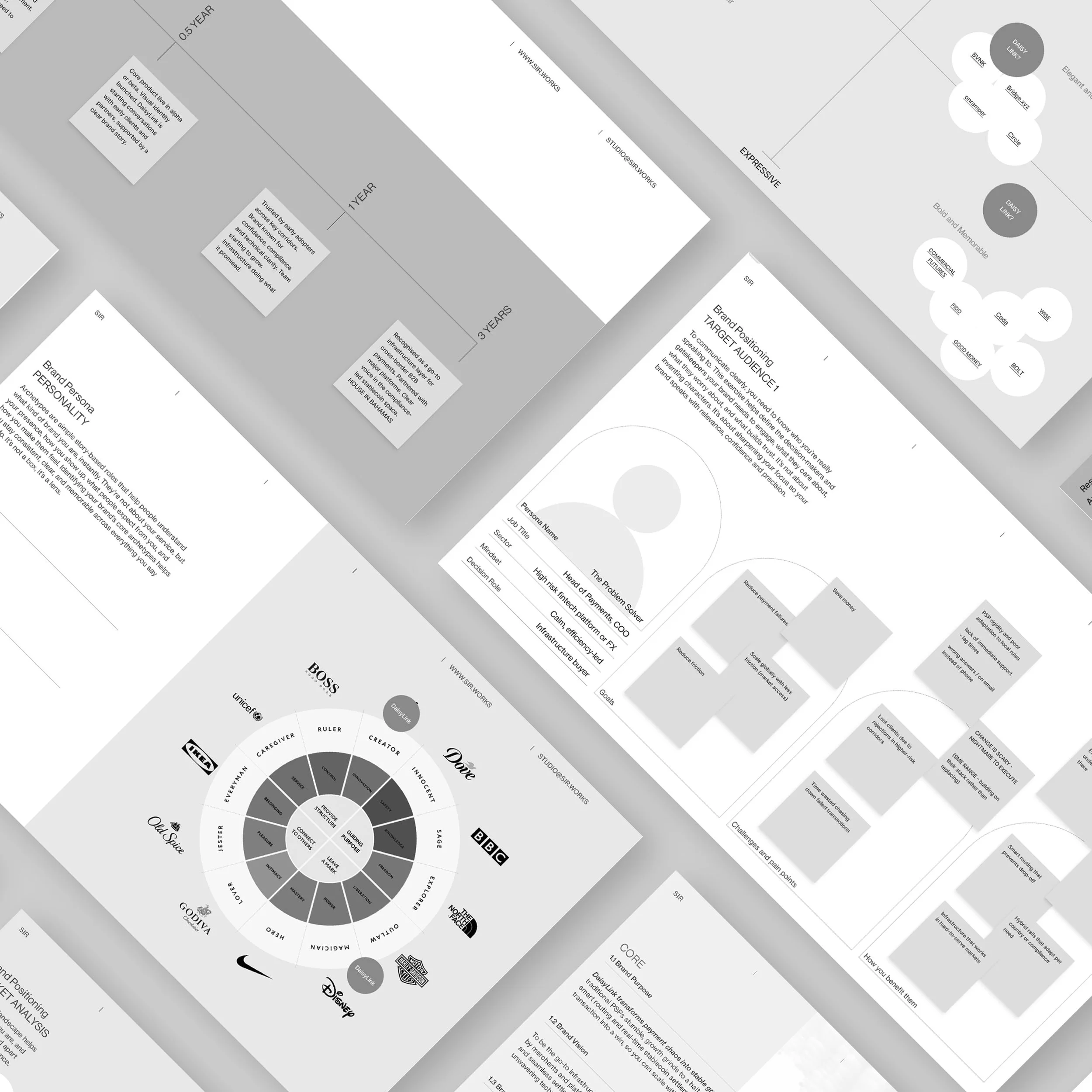
Strategy began with first principles. We clarified DaisyLink’s market position, audience priorities, and core tensions before any visual decisions were made. Early UX wireframes translated this thinking into a clear, credible product story, allowing complex payment flows to be explained simply and confidently ahead of platform build and launch.


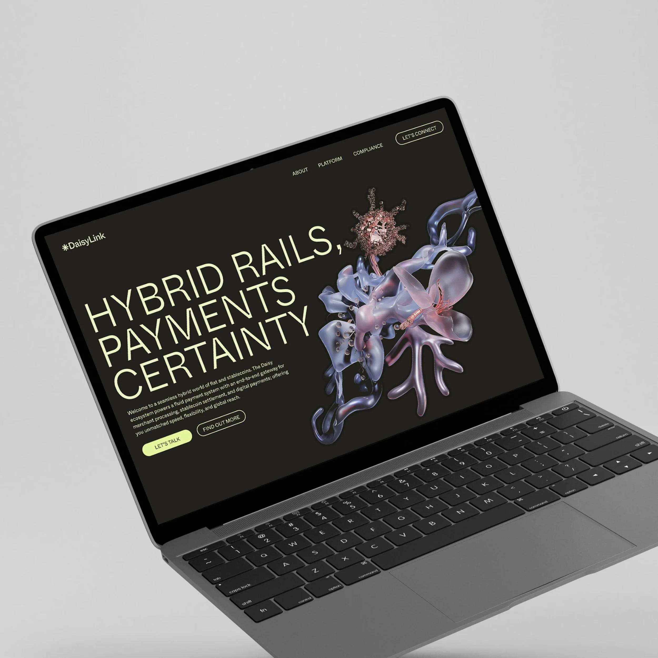
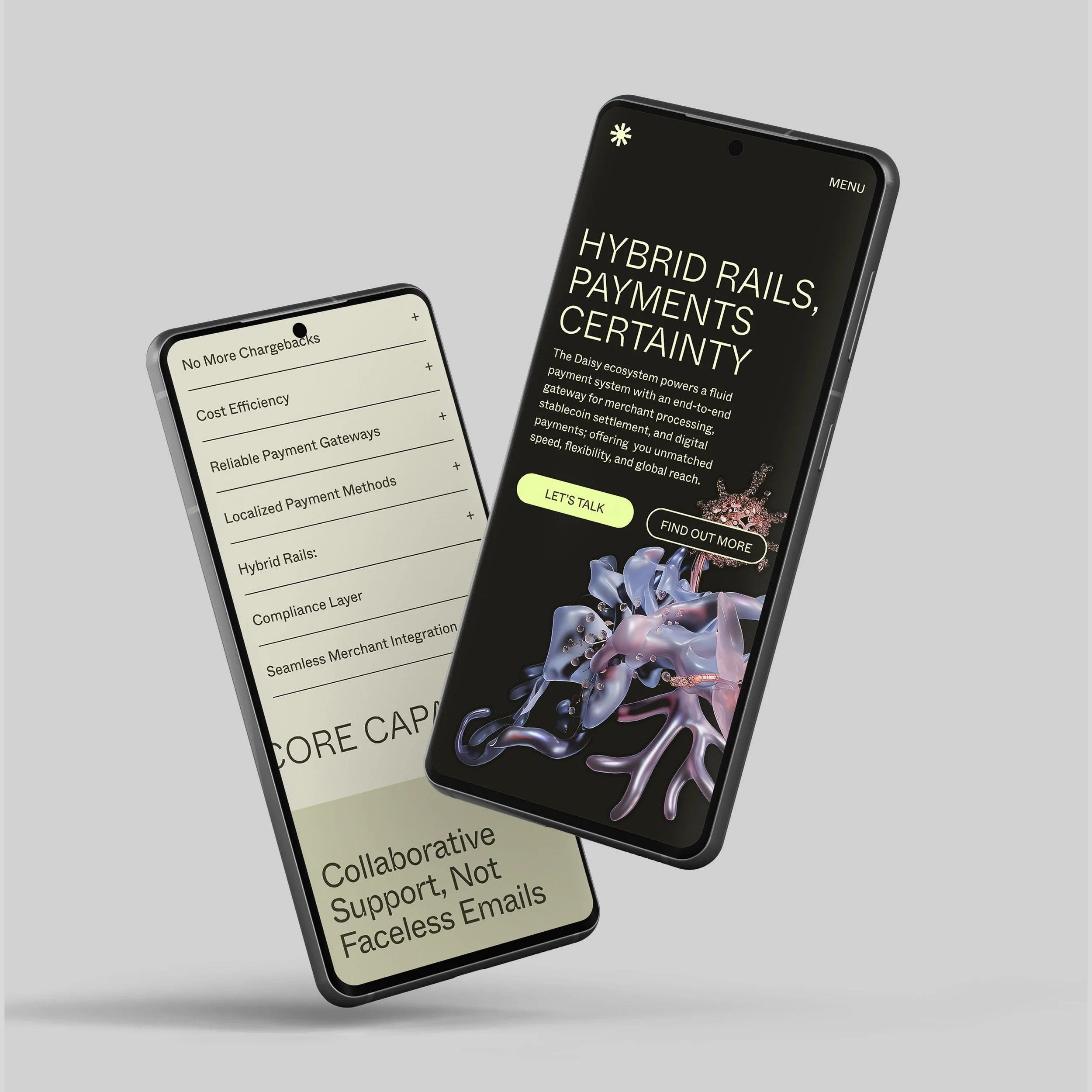
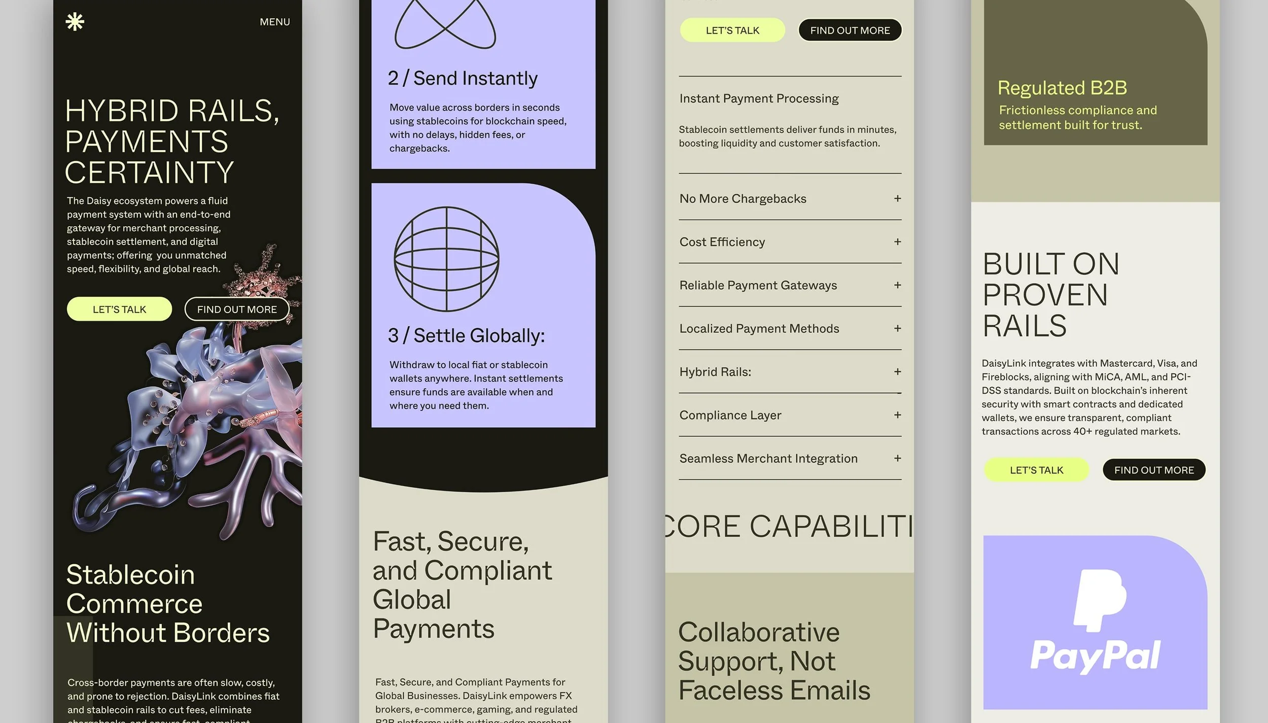
The icon reflects the product’s hub-and-spoke payment system, signalling engineered precision and seamless connection. Lowercase styling softens the tone, keeping the brand approachable in a trust-led category. The palette is grounded in muted natural greens, nodding to ecosystems and interconnected growth, and is complemented by light neutrals and soft lilac accents.


Generative forms and bio-digital textures express seamlessness and disruption in tension, reflecting DaisyLink’s ability to operate within regulatory frameworks while pushing the boundaries of payment infrastructure. Applied as a framing device across the website, the imagery anchors key messages, adds depth, and supports clarity and confident navigation through complex information.

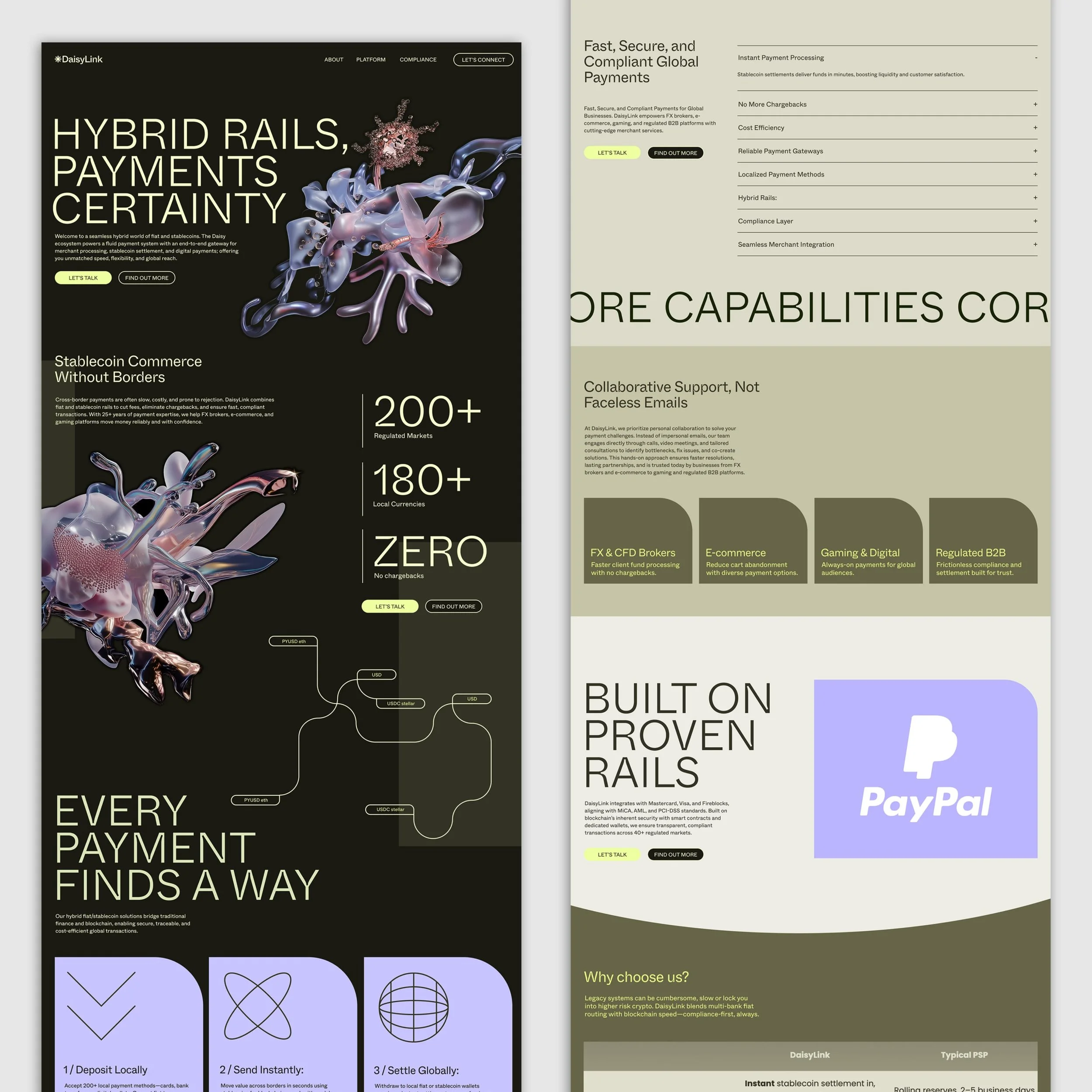
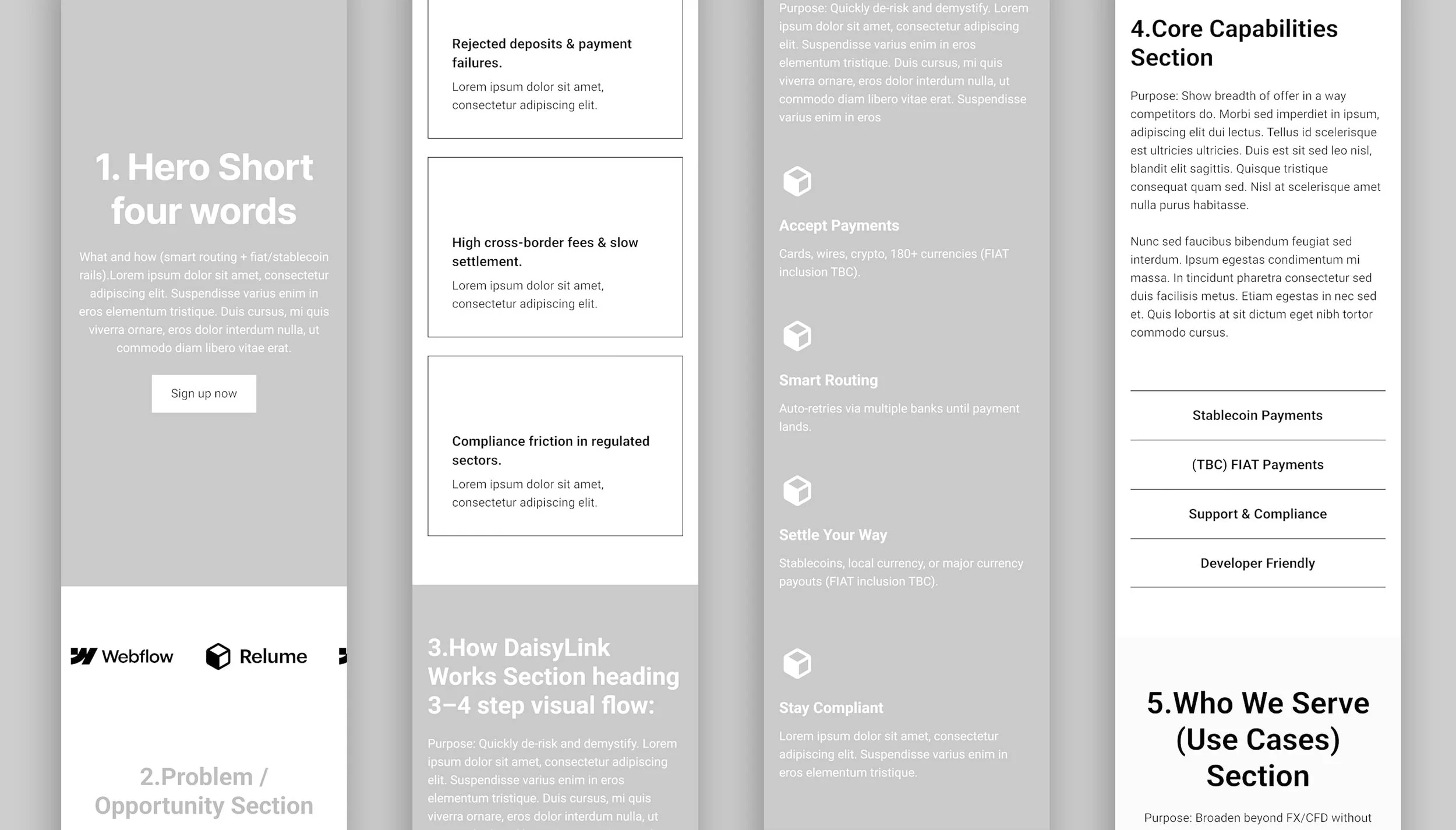
Clear hierarchy and modular sections translated technical complexity into a coherent, accessible experience. The website was designed to support investor confidence and regulatory credibility, using structure, pacing, and navigation to surface core propositions without overwhelming detail. Rather than flattening the platform’s sophistication, the layout allowed complexity to be revealed progressively, reinforcing DaisyLink’s position as dependable infrastructure operating confidently under scrutiny.


Repositioned a cyber-intelligence consultancy with a confident, systems-led identity rooted in discretion and authority.

See next
