
CASE
STUDY
TRISHA
HEWITT
COMMS
CASE STUDY
TRISHA HEWITT
COMMS
Trisha Hewitt Communications is a solo consultancy built on decades of experience in journalism and local government, specialising in high-stakes, people-first communications. The work centres on clarity under pressure, supporting public, third-sector, and purpose-led organisations when messages matter most. While Trisha’s reputation was well established, the brand needed to better reflect the depth, credibility, and calm authority of her practice, while creating space for future growth beyond the public sector. The identity also needed to function day to day without a designer, prioritising clarity, structure, and ease of use.
-
Client: Trisha Hewitt Communications
Sector: Communications Consultancy
Role: Creative Lead, Brand Strategist
Scope: Visual identity system
The challenge was to translate a deeply human, trust-led practice into a visual and strategic system without defaulting to consultancy tropes or personal branding clichés. The identity needed to feel credible, grounded, and quietly confident, avoiding both corporate polish and regional sentimentality. With no budget for a bespoke photoshoot, it was still important to retain human imagery as a way to communicate empathy and care. The resulting system balances simplicity with warmth, functioning across strategy workshops, advisory documents, and digital communications while remaining flexible enough to support new opportunities without losing Trisha’s voice. -
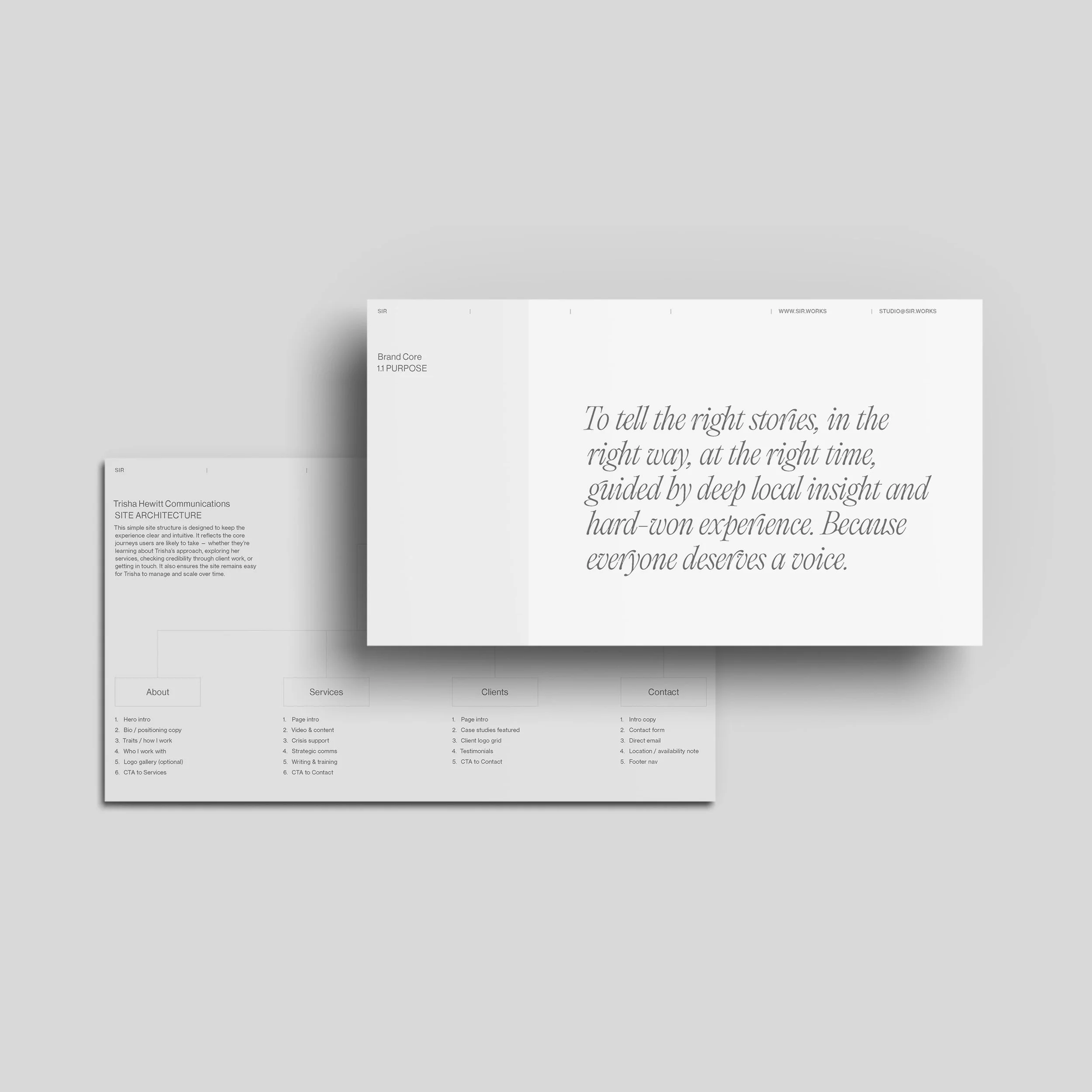
The strategy positioned Trisha as a calm, trusted advocate. Someone who listens first, translates complexity, and brings clarity without performance or ego. The work focused on defining a people-first communications practice rooted in empathy, trust, and professionalism. Rather than framing the consultancy as an agency, the positioning emphasises experienced, plainspoken support. Most valuable when pressure is high and confidence is needed.
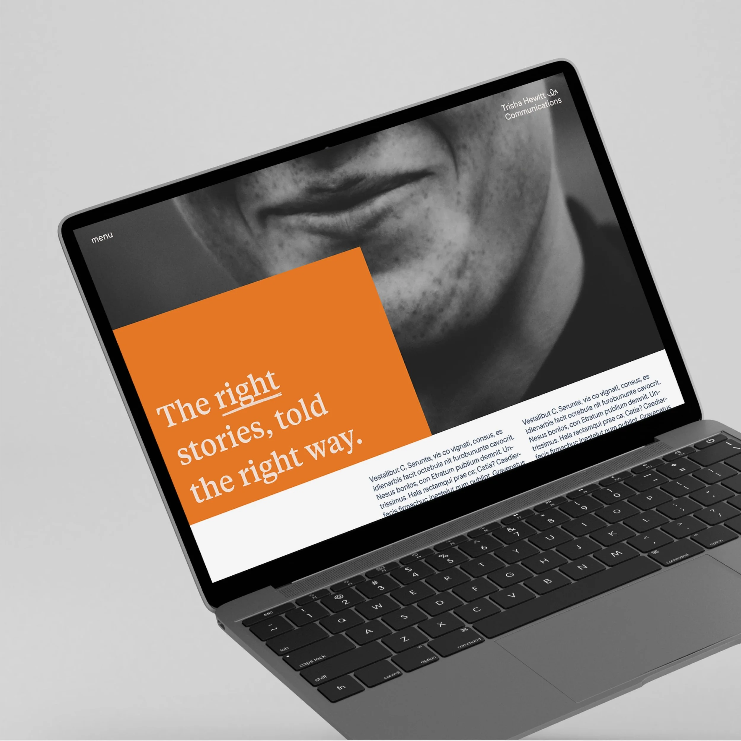
The visual language expresses advocacy through clarity rather than volume. Editorial structure, disciplined typography, and generous spacing establish calm and credibility. Tactile details and human imagery introduce warmth without sentimentality. A looping signature mark acts as a gesture of encouragement and continuity. Reinforcing trust under pressure while remaining grounded and quietly confident. -
The identity has been met with strong positive feedback, particularly around the new website, which has been praised for its clarity, tone, and sense of calm authority. Clients and peers have responded to the human quality of the work, noting how naturally the visual language supports Trisha’s way of communicating. The system has helped articulate the depth of her experience without overstatement, reinforcing trust and credibility at first touch. Rather than drawing attention to itself, the identity creates space for conversations to unfold clearly and confidently.
The new system provides Trisha with a coherent, flexible framework she can use across workshops, advisory materials, and client communications. It supports the complexity of her work while remaining accessible and grounded, allowing her to show up consistently across contexts. Importantly, the identity positions the practice for future growth beyond its public-sector roots, while preserving the voice, values, and steadiness that existing clients recognise. The result is a brand that feels settled, considered, and ready to evolve.
The before
What came before: A single pixelated logotype with no underlying strategy or visual system. This was a foundational project, requiring a full visual identity system to be developed from scratch.
The after
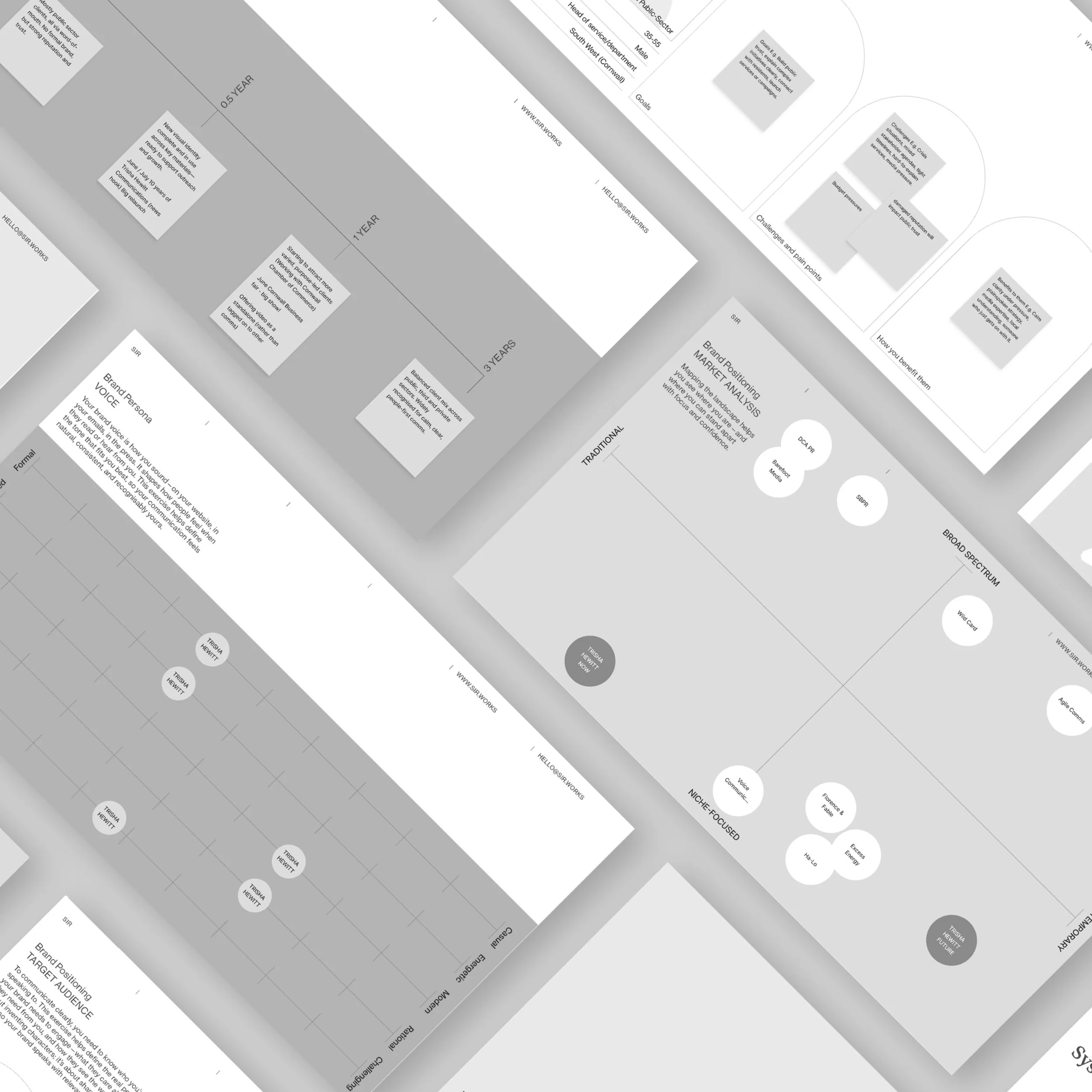
Early workshops focused on clarifying purpose, audience, and positioning, while mapping how the work would be experienced in practice. Brand foundations, user needs, and content priorities were defined together, informing both strategic direction and early UX and site architecture decisions.
Brand DNA principles were translated into clear information hierarchy and content structure. This ensured decisions around navigation, page flow, and messaging were grounded in how Trisha actually works, rather than abstract brand language.
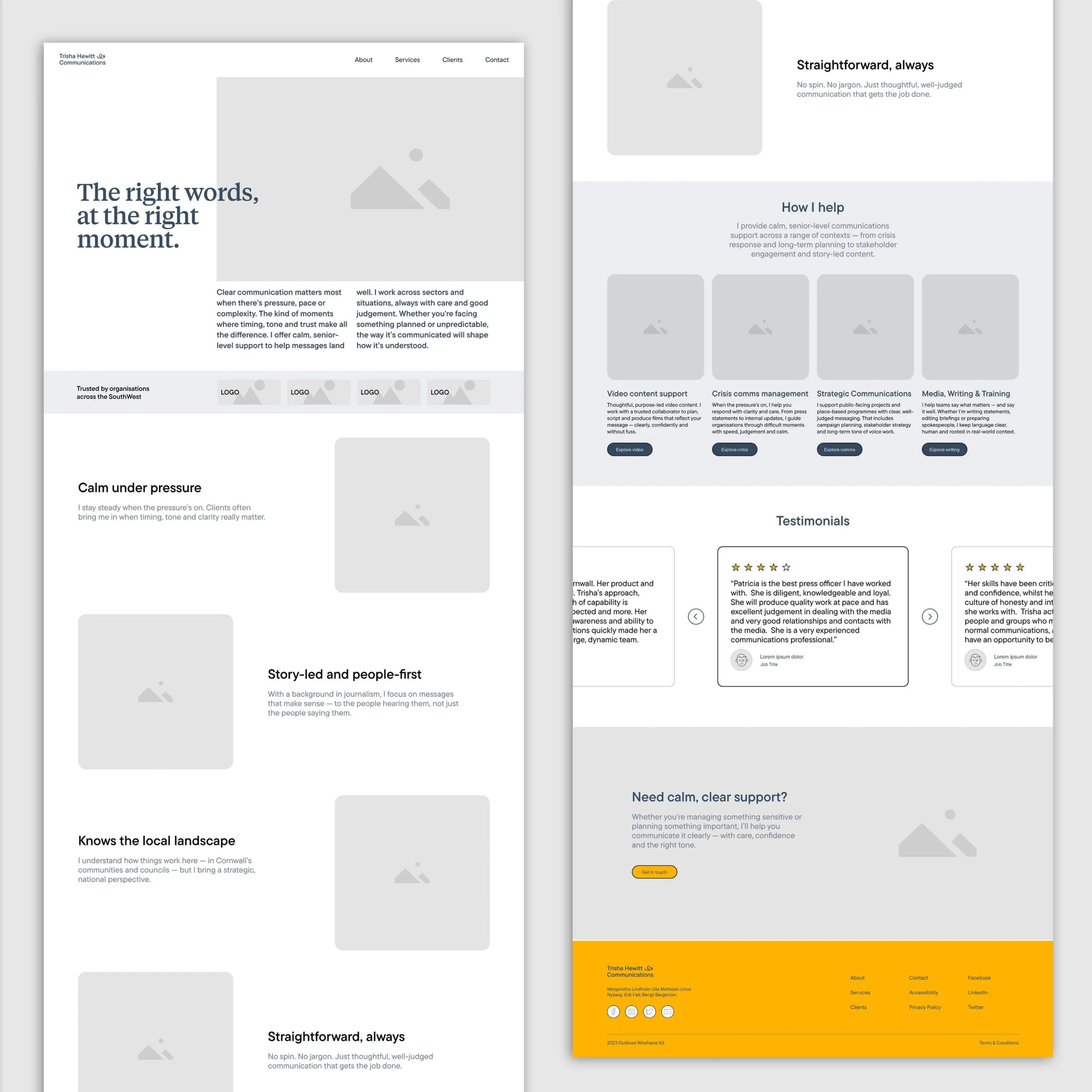


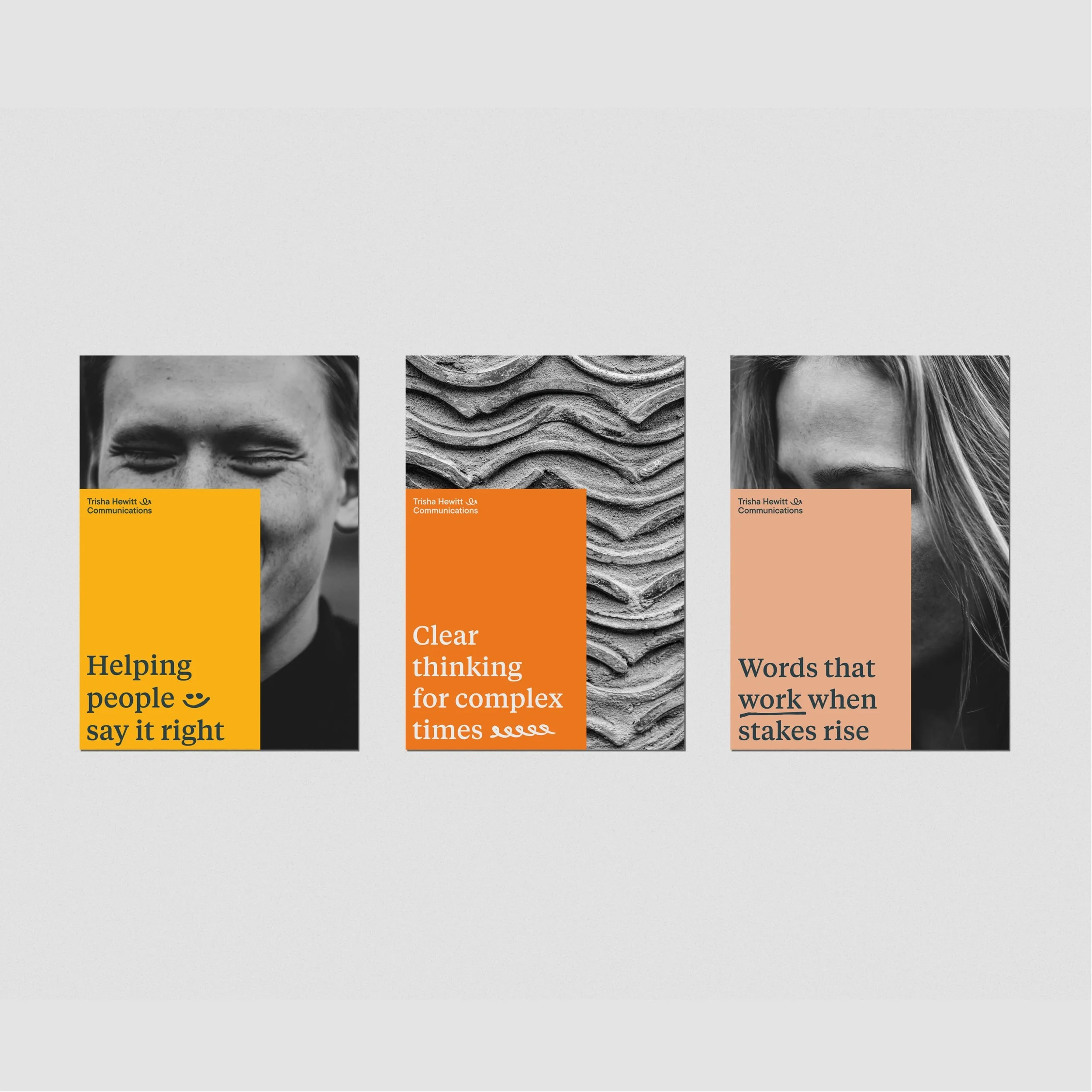
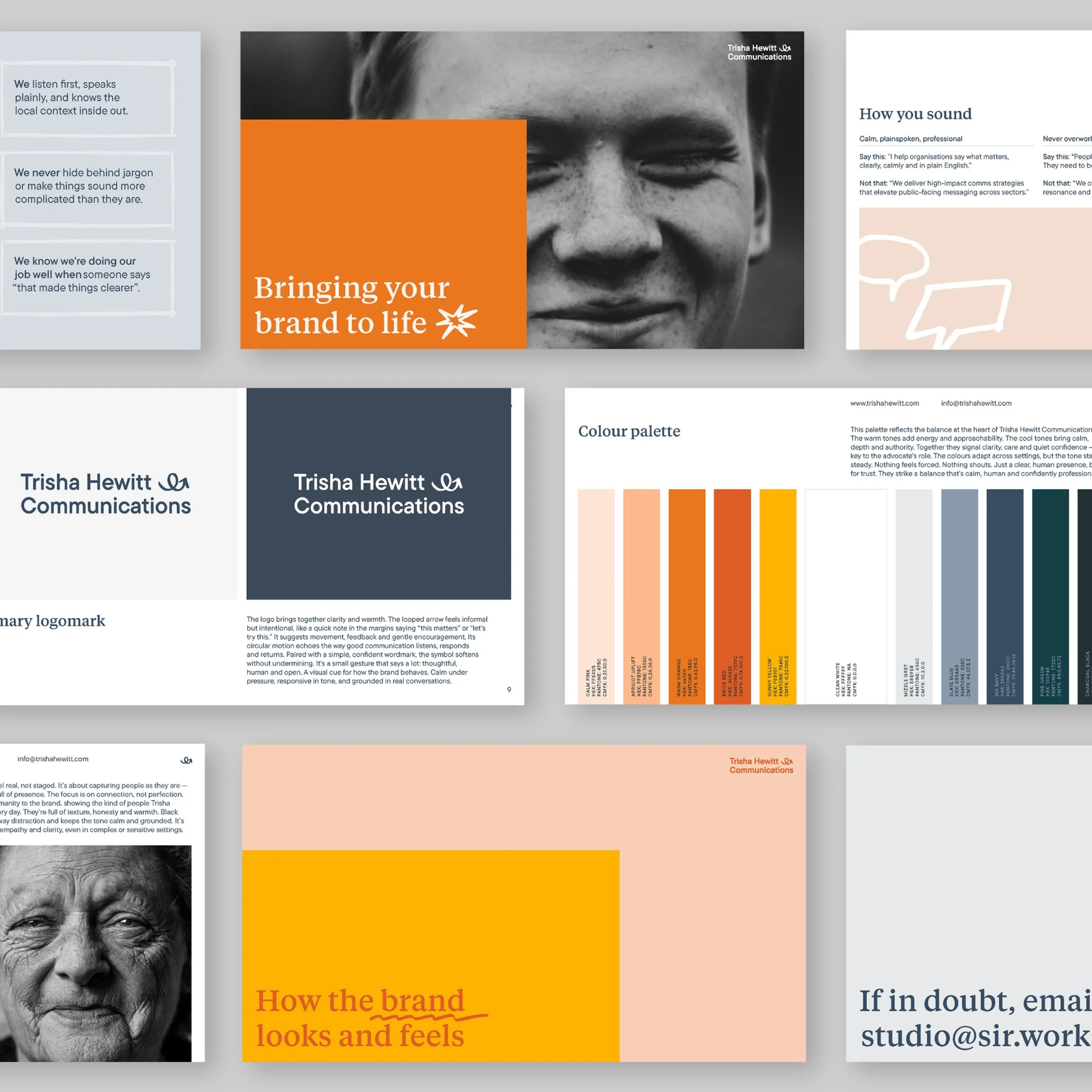
A calm, editorial system designed to support clarity under pressure: The visual language is built around advocacy through clarity rather than volume. Editorial layouts, disciplined typography, and generous spacing create calm and credibility, while tactile details and human imagery introduce warmth without sentimentality. Colour is used emotionally, not decoratively, to support trust, steadiness, and depth.
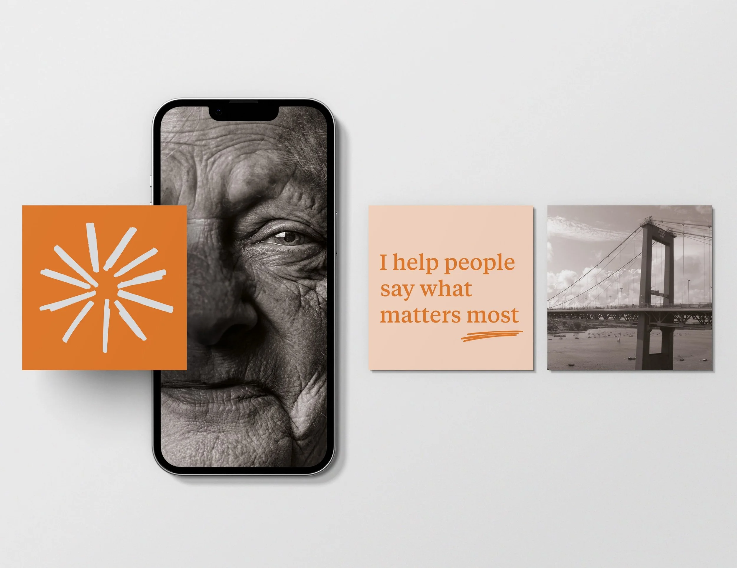
The identity is anchored by a looping mark that acts as a gesture rather than a symbol of authority. It suggests encouragement, continuity, and conversation, reflecting Trisha’s role as an advocate who listens first and guides with care. This human sensibility carries through the wider system, from restrained typography and a considered colour palette to the photography art direction, forming a calm, editorial identity built for trust and connection.
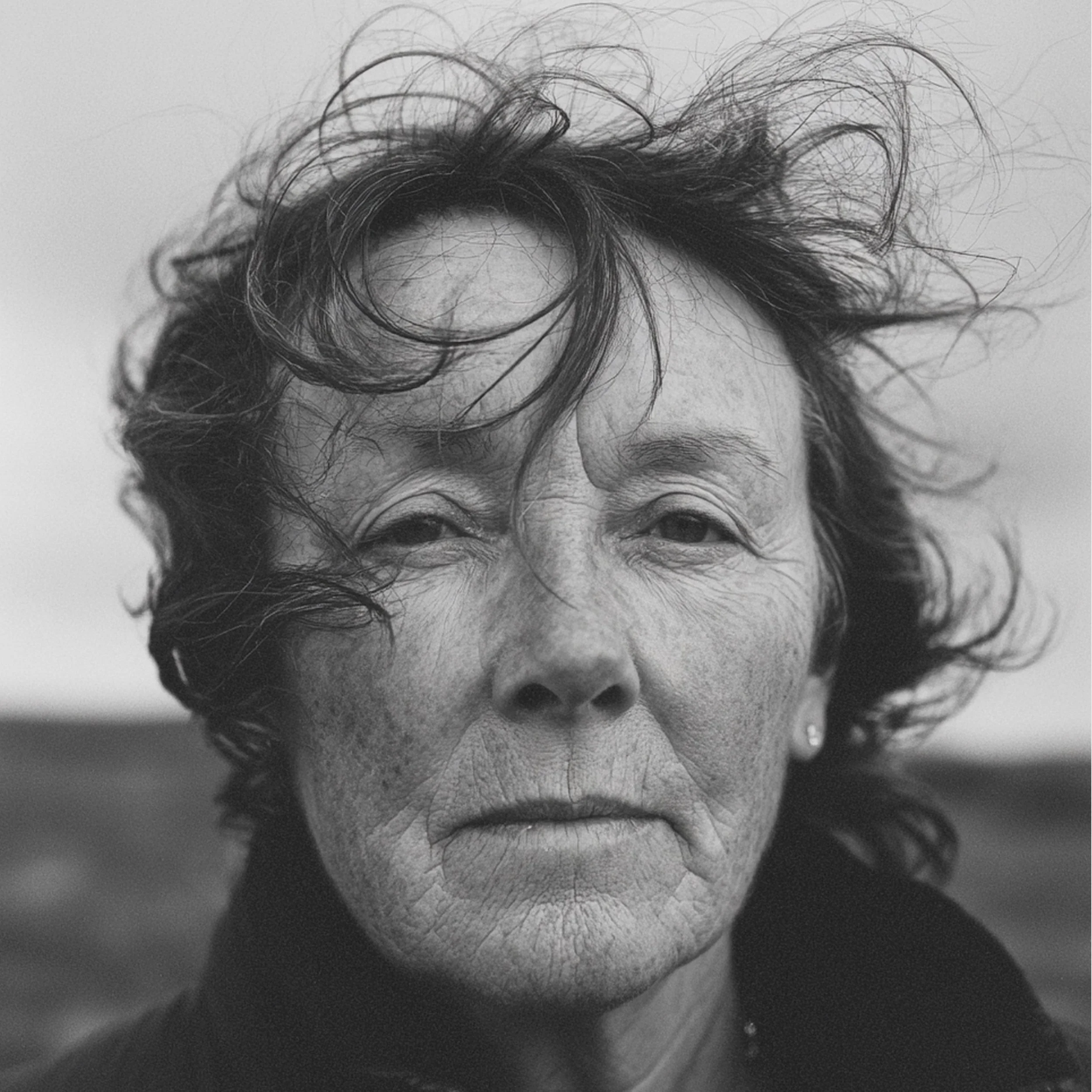

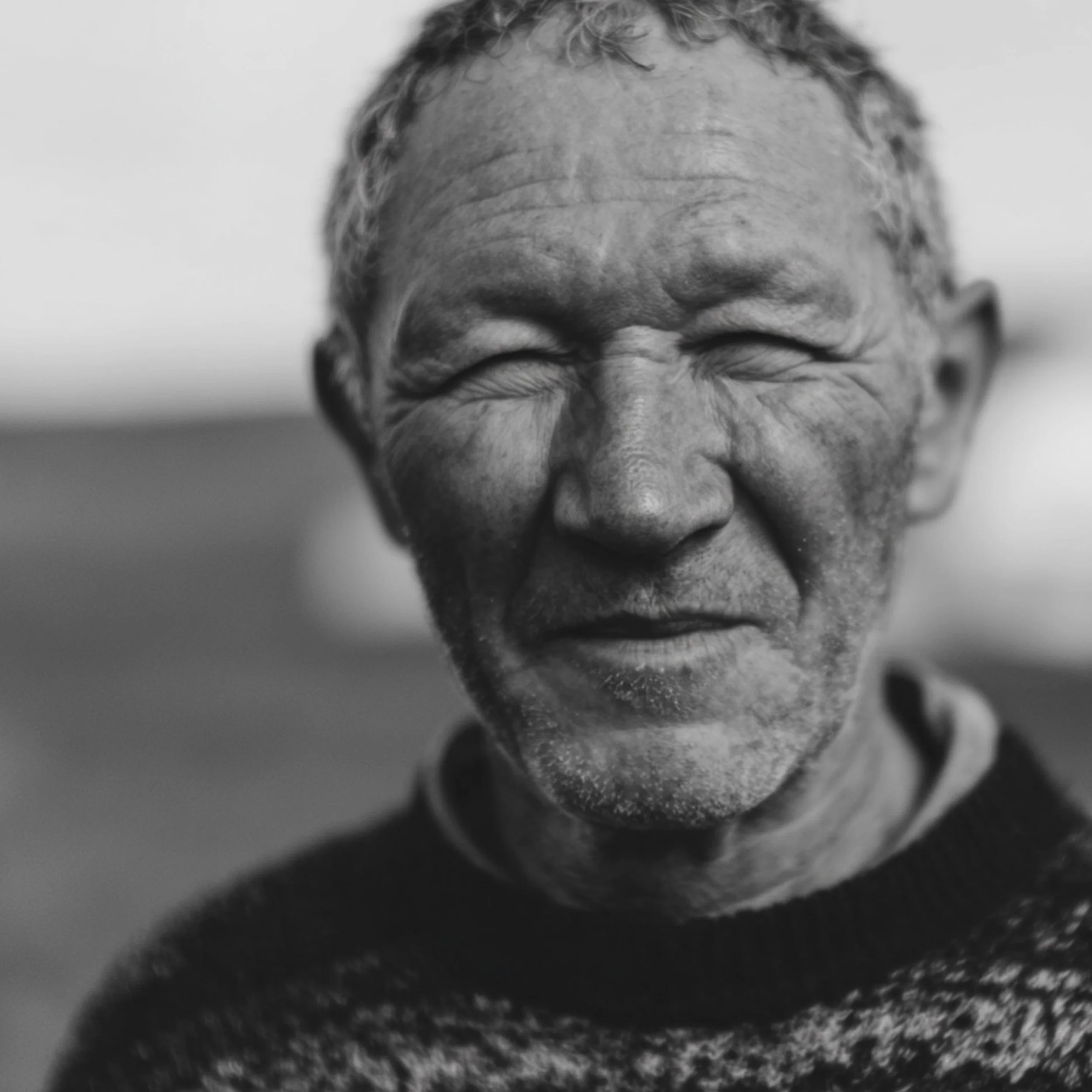
Photography plays with contrast: literal and abstract, direct and atmospheric. Portraits are honest and unembellished, expressing clarity, professionalism, and quiet confidence. In contrast, blurred motion and textured details nod to the unseen complexity of communications work. Together, they create a layered visual tone that feels human and discreet, grounded and analytical.
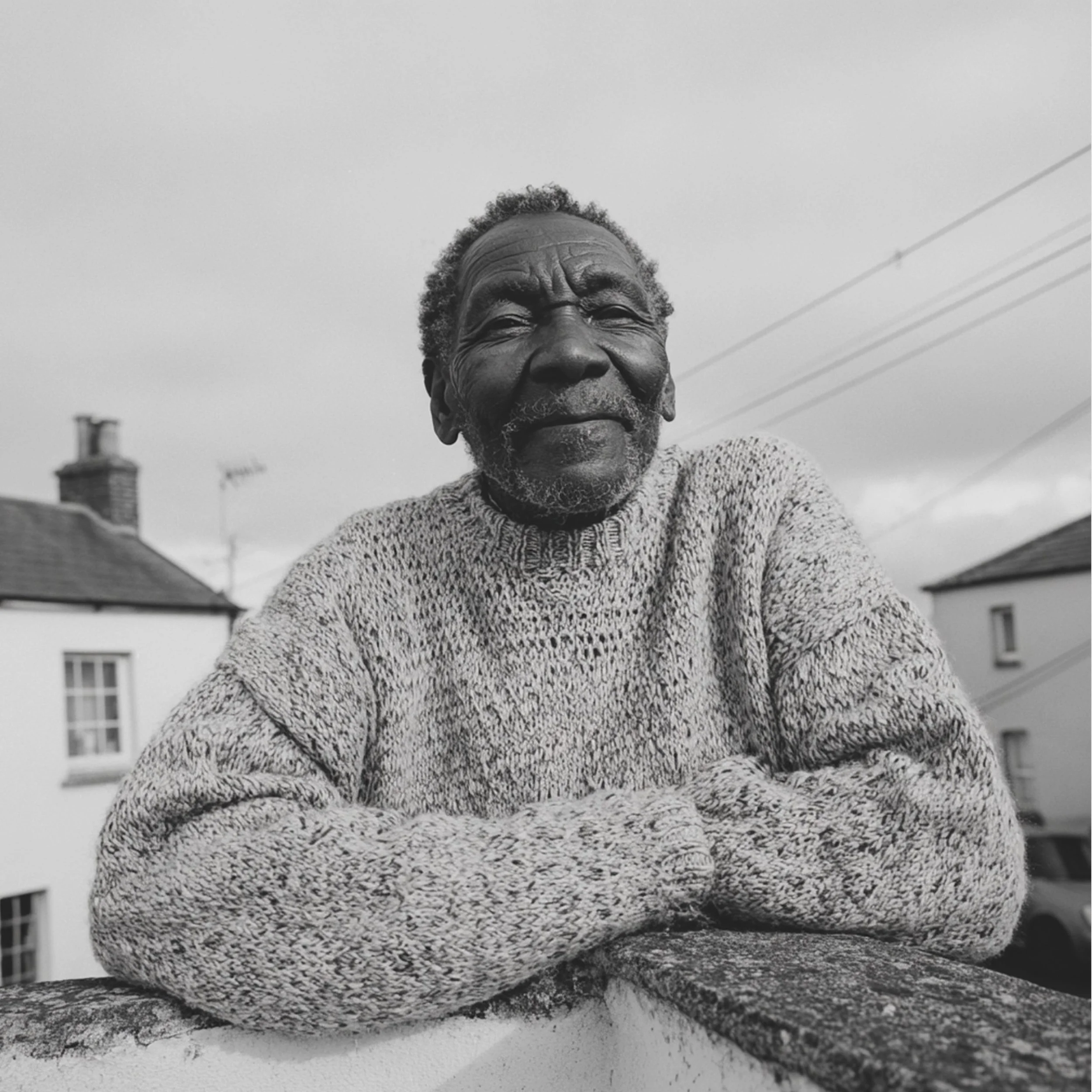

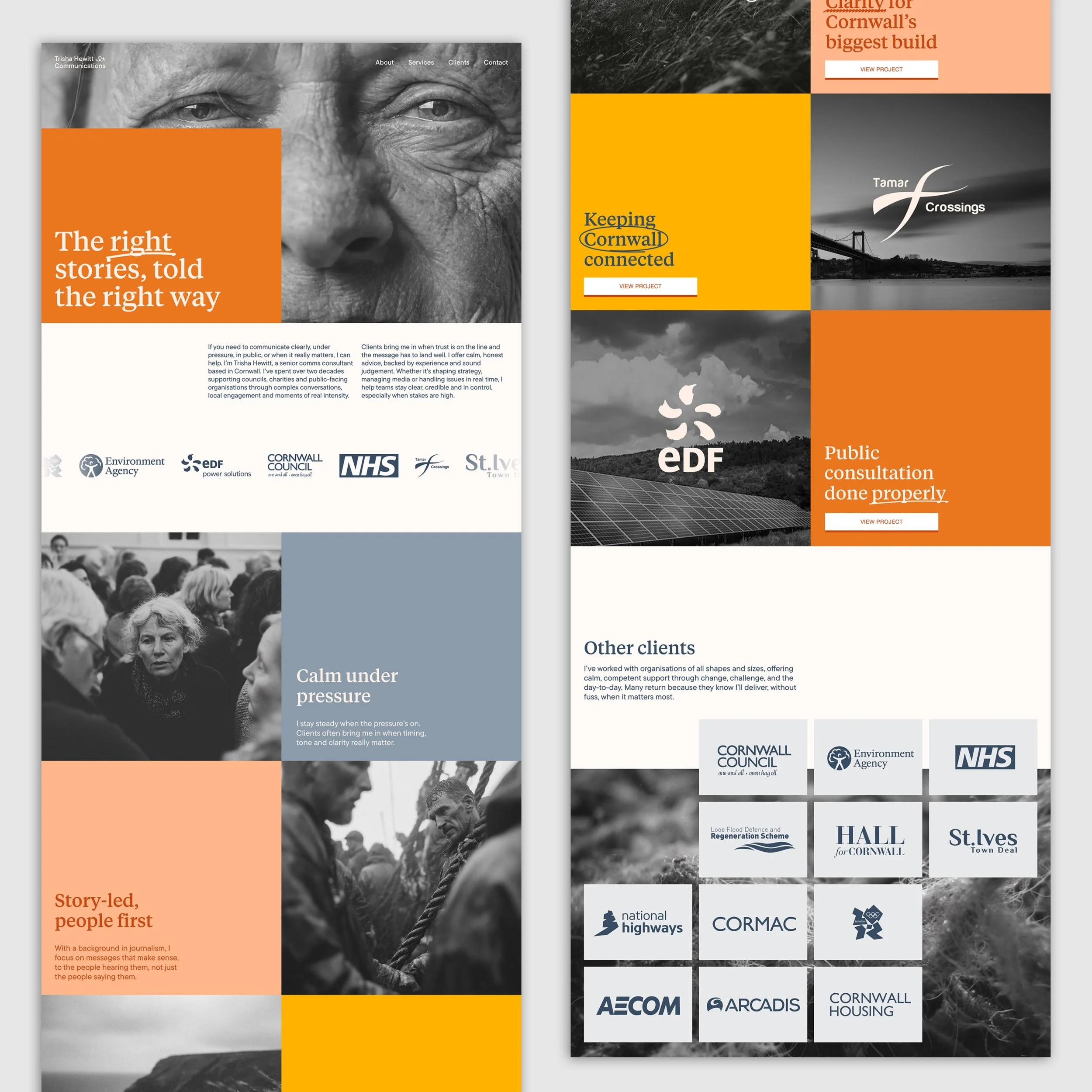
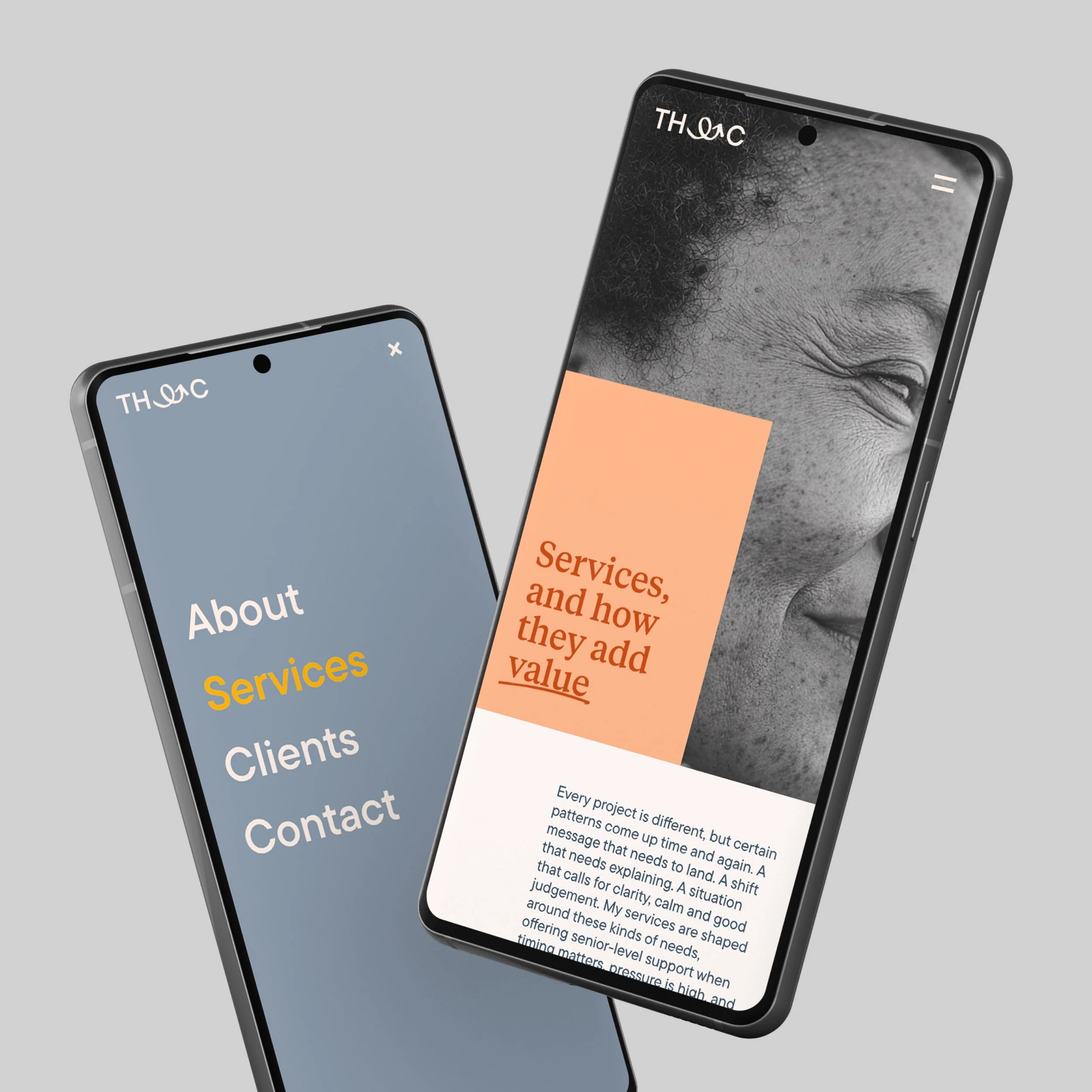
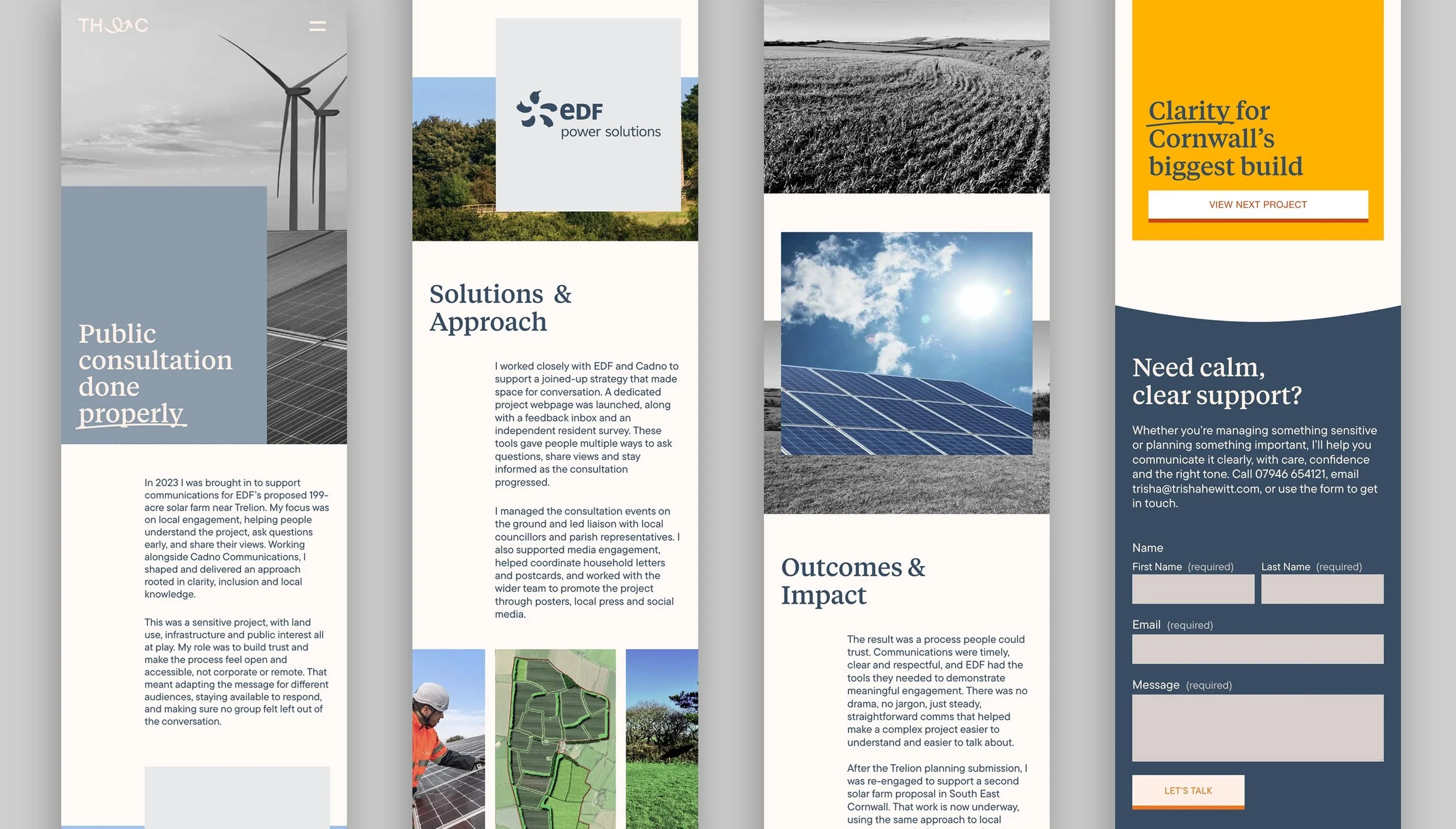
The website was designed to do its job: communicate clearly, build trust, and help the right people understand how Trisha works. Information architecture and content flow prioritise clarity and confidence over noise or sales tactics. AI-generated imagery was used selectively to convey a broader, more representative sense of Cornwall and its people than is typically available through stock photography, while also reducing production costs.
UX decisions focused on reducing cognitive load in high-stakes contexts. Page hierarchy, navigation, and content flow were designed to support confidence and comprehension, particularly for users arriving under pressure. Clear pathways across services, projects, and contact points allow content to lead, while consistent structure ensures the experience feels steady, considered, and trustworthy across devices.
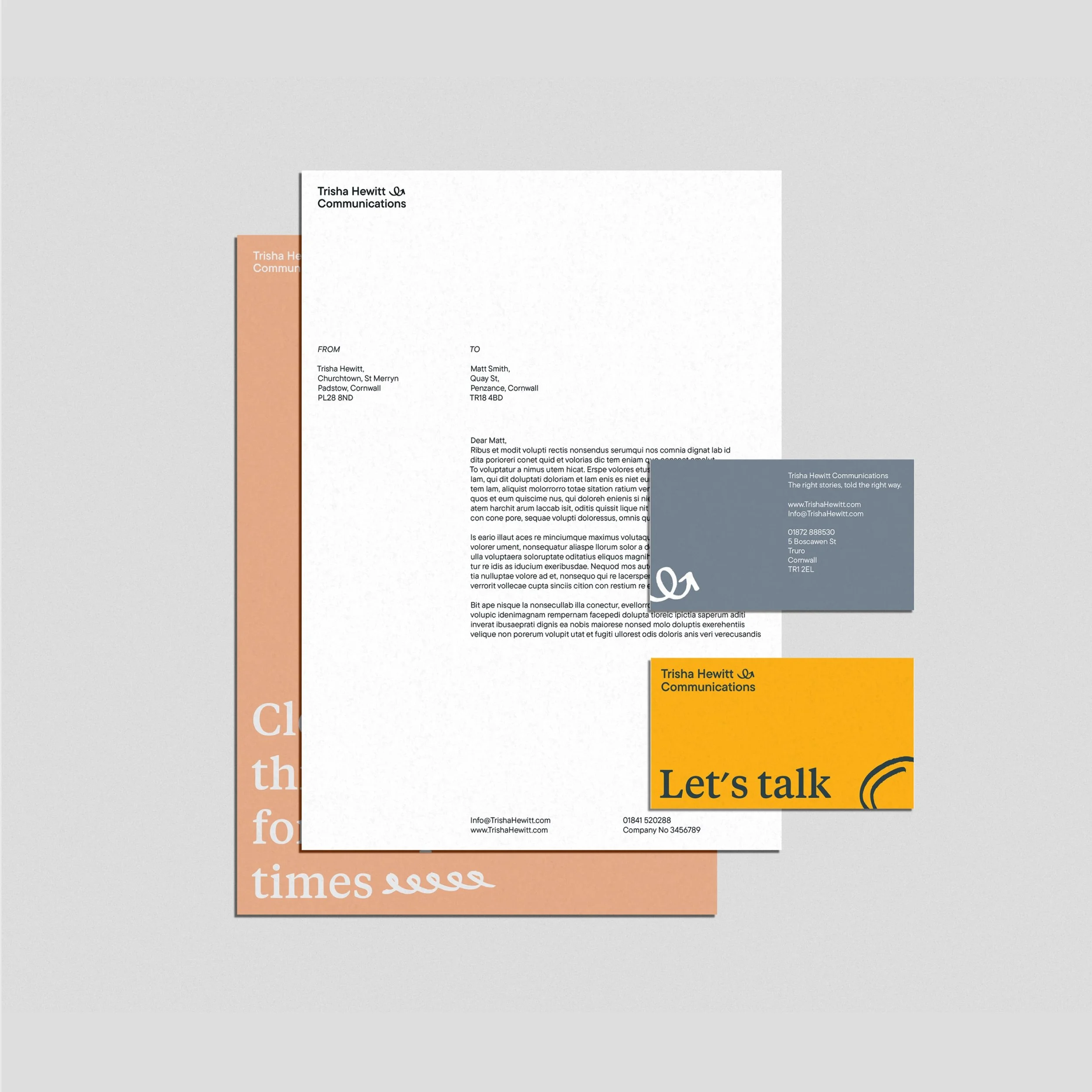
The identity was designed to scale across everyday communications, from social posts to stationary, assets needed to be used with ease for a non designer. Brand principles, tone, and visual rules are codified into a flexible toolkit that supports consistent decision-making without over-prescription. This allows Trisha to work responsively across channels while maintaining clarity, warmth, and credibility in fast-moving or sensitive contexts.
Taken together, the identity forms a coherent, human system built for real-world communication. It supports clarity under pressure, adapts across formats, and reflects the way Trisha works in practice: calm, grounded, and people-first. The result is a brand that feels settled and trustworthy, while remaining flexible enough to grow with the work and the opportunities ahead.


Built a scalable identity system for a purpose-led start-up tackling ocean plastic. Strategy, design, and rollout to support rapid growth and partnerships